… for Visual Effects

Tip #502: The Challenges of Changing a Color

Larry Jordan – LarryJordan.com

Gray-scale values provide texture.

Texture comes from gray-scale. We can change hue, but not brightness.

Topic $TipTopic

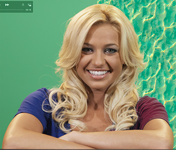
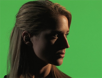
This is Brittney. She’s one of the models from the now-defunct GlamourKey.com website. She’s wearing a deep blue shirt. Except, the script called for her to wear burgundy. Or maybe light pink, it was a toss-up…

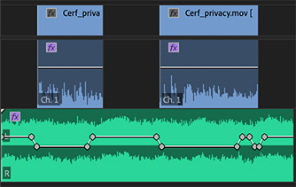
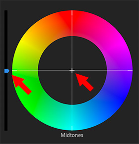
The problem is that when we are changing the color of something in post, we can change it’s hue or saturation, but we can’t change it’s gray-scale. Why? Because variations in gray-scale provide objects their texture. If I replace both color and gray-scale her shirt, which has nice folds in the sleeves, suddenly become a block of solid, undistinguished color.

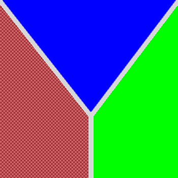
NOTE: To prove the point about texture, the background behind Brittney on the left has a single gray-scale value: 50%. The background behind her on the right, has gray-scale values that range from 0 to 100.

So, in Brittney’s case, I can replace dark blue with dark green, or dark red, but not light pink, because I can’t change the gray-scale values enough in her shirt to create light pink from burgundy.


Please rate the helpfulness of this tip.

Click on a star to rate it!

… for Visual Effects

Tip #501: Lighting for Green-Screen

Larry Jordan – LarryJordan.com

Light the background for evenness. Light the foreground for drama.

Here, Lisa is lit for drama, while the background is lit evenly.

Topic $TipTopic

One of the challenges that new cinematographers face in lighting green-screen shots is that there is almost no correlation between the lighting of the background versus the foreground. In fact, they should be lit separately. Here’s why.

Lisa, in this screen shot, is an excellent example.

The background is a highly-saturated green because the key needs color, not just brightness, to work. As well, the background is very evenly lit and, if you looked at it on the Waveform Monitor, it would be right at 50% grayscale. (This is because 50% gray is the optimum value for maximizing color saturation.)

But, Lisa, herself, is very dark. This is because it is a very dramatic scene and it needs to be dark. It could, in fact, be a silhouette. There is NO correlation between how you light the foreground from the background.

One other important point to keep in mind: To minimize spill from the green background hitting the shoulders and hair of the foreground talent, try to keep talent ten feet or more in front of the green background. (In this screen shot, Lisa was 12 feet in front of the background.)


Please rate the helpfulness of this tip.

Click on a star to rate it!

… for Visual Effects

Tip #500: When is a Green-Screen Key Red?

Larry Jordan – LarryJordan.com

The only requirement for a chroma-key is that the background color not be used in the foreground.

In this illustration, the color red is translucent, because we are using it as the key color.

Topic $TipTopic

Green-screen is shorthand for a “chroma-key,” that is a key based upon a color. We remove a background by making all the pixels of a certain color transparent so we can put something else in its place. However, a “green-screen key” doesn’t, in fact, require anything green. It’s just that, when people are involved, we use green more than any other color. In the past, video used blue backgrounds, while film used green, simply due to how video and film responded to the two different colors.

Over time, we standardized on green because it is a color that is not in human skin tone and, while many of us like wearing varying shades of blue, green is much more rare in clothing.

NOTE: However, if you are creating a key to recreate a night scene, you are better off using a blue background, because moonlight is very blue and the edges of the key will fit in better with the night look.

What a chroma key does is look at the color of each pixel. If it finds one that matches the color you want to remove, it makes that pixel transparent. The key color could be green for people, red for lizards or blue for, say, an agricultural spot set in a cornfield.

There’s no magic that determines which color you use – any modern keyer can key on any color. Pick the one that works the best for your project. (Like the red backgrounds I saw used for “The Lizard King from Outer Space.” Very, very weird.)


Please rate the helpfulness of this tip.

Click on a star to rate it!

… for Codecs & Media

Tip #505: Why HDV Media is a Pain in the Neck

Larry Jordan – LarryJordan.com

Interlacing, non-square pixels, and deep compression make this a challenging media format.

Topic $TipTopic

HDV (short for high-definition DV) media was a highly-popular, but deeply flawed, video format around the turn of the century.

DV (Digital Video) ushered in the wide acceptance of portable video cameras (though still standard definition image sizes) and drove the adoption of computer-based video editing.

NOTE: While EMC and Avid led the way in computerized media editing, it was Apple Final Cut Pro’s release in 1999 that converted a technology into a massive consumer force.

HDV was originally developed by JVC and supported by Sony, Canon and Sharp. First released in 2003, it was designed as an affordable recording format for high-definition video.

Their were, however, three big problems with the format:

  • It was interlaced
  • It used non-square pixels
  • It was highly! compressed

If the HDV media was headed to broadcast or for viewing on a TV set, interlacing was no problem. Both distribution technologies fully supported interlacing.

But, if the video was posted to the web, ugly horizontal black lines radiated out from all moving objects. The only way to get rid of them was to deinterlace the media, which, in most cases, resulted in cutting the vertical resolution in half.

In the late 2000’s Sony and other released progressive HDV recording, but the damage to user’s perception of the image was done.

NOTE: 1080i HDV contained 3 times more pixels per field than SD, yet was compressed at the same data rate. (In interlaced media, two fields make a frame.)

The non-square pixels meant that 1080 images were recorded at 1440 pixels horizontally, with the fatter-width pixel filling a full 1920 pixel line. In other words, HDV pixels were short and fat, not square.

As full progressive cameras became popular – especially DSLR cameras with their higher-quality images, HDV gradually faded in popularity. But, even today, we are dealing with legacy HDV media and the image challenges it presents.


Please rate the helpfulness of this tip.

Click on a star to rate it!

… for Codecs & Media

Tip #503: Why Timecode Starts at 01:00:00:00

Larry Jordan – LarryJordan.com

It all comes down to finding what you seek.

A sample timecode setting displayed as: Hours, Minutes, Seconds and Frames.

Topic $TipTopic

Back in the old days of video tape, all programs originating in North America (and, perhaps, elsewhere) started at timecode hour 01. A tradition that often continues today for broadcast, mostly out of habit. Why?

NOTE: Programs originating in Europe, I discovered many years ago, tended to start at hour 10. This made it easy to quickly see which part of the world a program originated from.

Back in the days of large quad videotape machines, each of which could easily cost a quarter-of-a-million dollars, the tape reels were 15-inches in diameter and weighed up to 30 pounds. The tape flew through the system at 15 inches per second – all to create a standard-definition image!

Setting up a quad tape system for playback required tweaking each of the four playback heads on the machine and adjusting them for alignment, color phase, saturation and brightness. (It was these machines that first taught me how to read video scopes.)

The problem was that getting this much iron moving fast enough to reliably play a picture took time. Eight seconds of time.

So, the standard setup for each tape required recording:

  • 60 seconds of bars and tone (to set video and audio levels)
  • 10 seconds of black
  • 10 seconds of slate
  • 10 seconds of countdown

If timecode started at 0:00:00:00 for the program, that would mean the setup material would start at 23:58:30:00. Since 23 hours is after 0 hours, sending the tape machine to seek the starting timecode – an automated feature that was used all the time in the high-speed, high-pressure turnaround of live news – means the tape deck would scan forward to the end of the tape.

To prevent this, all programs started at 1 hour (or 10 hours) with setup starting at 00:58:30:00.

And now you know.


Please rate the helpfulness of this tip.

Click on a star to rate it!

… for Codecs & Media

Tip #499: What is Pixel Aspect Ratio?

Larry Jordan – LarryJordan.com

Pixel aspect ratios were used in the past to compensate for limited bandwidth.

An exaggerated example of non-square pixels used in a variety of SD video.

Topic $TipTopic

Pixel aspect ratios determine the rectangular shape of a video pixel. In the early days of digital video, bandwidth, storage and resolution were all very limited. Also, in those days, almost all digital video was displayed on a 4:3 aspect ratio screen.

This meant that the image was 4 units wide by 3 units high, composed of 720 pixels across and 480 pixels high. (The reason I use the word “units” was that then, like now, monitors came in different sizes, but all had the same resolution regardless of size.)

However, standard definition video, though displayed as a 4×3 images, was composed of 720 pixels horizontally by 480 pixels vertically. This was not 4×3. To get everything to work out properly, instead of being square, each pixel was tall and thin. Each pixel was 0.9 units wide to 1.0 unit tall. (The screen shot shows an exaggerated example of this difference in width.)

As digital video started to encompass wide screen, rather than add more pixels, which was technically challenging, engineers changed the shape of the pixel to be fat. (A pixel aspect ratio of 1.0×1.2) This provided wide screen support (16×9 aspect ratio images) without increasing pixel resolution or, more importantly, file size and bandwidth requirements.

These non-square pixels continued for a while into HD video, with both HDV and some formats of P2 using non-square pixels.

However, as storage capacity and bandwidth caught up with the need for more pixels in larger frame sizes, pixels evolved into the square pixels virtually every digital format uses today. This greatly simplified all manner of pixel manipulation.

However, most compression software has settings that allow it to work with legacy formats back in the days when pixels weren’t square.


Please rate the helpfulness of this tip.

Click on a star to rate it!

… for Adobe Premiere Pro CC

Tip #445: More Mask Tricks in Premiere

Larry Jordan – LarryJordan.com

While masks can’t be combined, we can create more than one mask in a clip.

Two separate circle masks applied to the same clip.

Topic $TipTopic

While we can’t combine masks in Premiere, nor select multiple masks at the same time, we can create multiple masks to create unusual shapes. Here’s how.

In this screen shot, I am using two separate circle masks to isolate each of the berries. This effect involves two versions of the same clip:

  • The top clip contains the masks
  • The bottom clip has been desaturated

Because I want to see the desaturated clip below the clip containing the masks, we need to create an Opacity mask. If we simply want to affect a portion of the image, say to apply a blur, we would create a mask in the Blur effect itself.

In this example, I drew two circle masks and adjusted each one’s shape to match the curves of each berry. There’s one mask for each berry. I slightly feathered each mask, then, in the lower clip desaturated it almost completely. (I retained a little bit of color so that the color edges around the berry which weren’t removed by the mask wouldn’t look too obvious.)

If the berries move, click the right-pointing arrow just below the mask name (i.e. Mask (1)) to track the mask with the movement of the berries.


Please rate the helpfulness of this tip.

Click on a star to rate it!

… for Adobe Premiere Pro CC

Tip #444: Automatic Audio Ducking

Larry Jordan – LarryJordan.com

Auto-Ducking is a VERY fast way to generate standard audio keyframes.

An ambience clip with auto-ducking keyframes applied to it.

Topic $TipTopic

Auto-ducking automatically applies audio level keyframes to a music or sound effects clip in response to dialog clips above it. It generates keyframes very quickly and, even better, each keyframe is fully adjustable after they are applied. Here’s how it works:

  • Switch to the Audio workspace in Premiere.
  • Select all dialog clips, then apply the Dialog tag.
  • Select all the clips you want to “duck,” or lower, when someone is speaking and apply either the Music, Sound Effects or Ambience tag.
  • Open, say, the Music tag.
  • Check Ducking to enable it.
  • Select the icon representing the reference audio for the keyframes; in most cases this will be Dialog.
  • Click Generate Keyframes.
  • Listen to the results. If you don’t like the overall levels, change the Duck Amount to more accurately reflect how much you want the volume lowered.
  • Click Generate Keyframes, again.

Repeat this process until you have levels you like.

NOTE: Modify Fades to adjust how quickly the audio levels change.

EXTRA CREDIT

Every keyframe set by Auto-ducking is a standard keyframe. You can adjust each one individually to create exactly the mix you want. Auto-ducking simply applies them faster.


Please rate the helpfulness of this tip.

Click on a star to rate it!

… for Adobe Premiere Pro CC

Tip #417: How Do Color Wheels Work?

Larry Jordan – LarryJordan.com

Color wheels combine precision with ease-of-use.

The Midtones color wheel in Adobe Premiere Pro CC.

Topic $TipTopic

I much prefer modifying colors using color wheels than curves. Partly, I think, this is due to long years working with Vectorscopes in video.

In Premiere, when you switch to the Lumetri Color panel in the Color workspace, one of the options is Color Wheels & Match.

Color wheels adjust all three color elements of a pixel: gray-scale, hue and saturation. Each wheel affects one-third of the image: shadows, mid-tones and highlights separately. This gives us a lot of control over different elements of the image.

The slider on the left alters gray-scale; up makes things brighter. The center cross-hair simultaneously alters hue and saturation. Grab the cross-hair and drag it toward the color you want to add. The farther you drag it from the center, the greater the saturation.

The color wheel has a black center when no changes have been made and a solid center when a color adjustment is in place.


Please rate the helpfulness of this tip.

Click on a star to rate it!

… for Apple Final Cut Pro X

Tip #490: What is Range Check?

Larry Jordan – LarryJordan.com

Range Check flags excessive white levels or chroma (color) saturation.

The View menu in the top right corner of the Final Cut Viewer, showing Range Check options.

Topic $TipTopic

Have you ever wondered what “Range Check” does in the View menu? It’s actually really useful – it flags excessive white and chroma (color) saturation levels. Here’s what you need to know.

If you are posting media to the web, virtually any gray-scale or chroma value will be fine. The web is very forgiving.

But, not so broadcast, cable or digital cinema. Here, because of technical constraints, white levels can not exceed 100% and chroma levels can’t exceed certain amounts of saturation.

What Range Check does is flag – using a moving series of red lines (see screen shot) – areas of the frame that exceed white level limits (Luma), excessive saturation (Chroma) or both (All).

To fix this problem, either adjust your color grading or apply Effects > Color > Broadcast Safe.


Please rate the helpfulness of this tip.

Click on a star to rate it!