… for Apple Motion

Tip #1554: Just Playin’ Around

Larry Jordan – LarryJordan.com

Don’t forget to adjust opacity or blend modes to help blend elements.

The “Flying Space Rock (and shadow)” along with the the Layers pane.

Topic $TipTopic

Here’s an interesting technique that creates synced movement using a copied motion path… and a flying space rock.

What, I wondered, would a flying space rock look like? Clearly, it needs to move and, because I could, I added a floating green cloud behind it – tracking it’s movements.
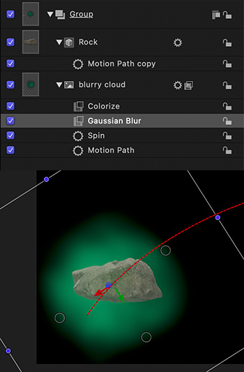
THE ROCK

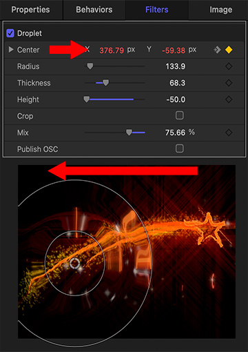
The Rock is a 3D shape in the Motion Library (3D Objects).

  • Add it to the Viewer
  • Apply Basic Motion > Motion Track
  • Option-click the red motion track line to add a keyframe to the track and create a curve.
  • Change Inspector > Properties > Opacity to 80% to blend the Rock with the Cloud.

THE CLOUD

Blurry Cloud is in the Motion Library (Content > Particle Images).

  • Add it to the Viewer
  • Change Inspector > Properties > Opacity to 50% to soften and add translucency.
  • Change Properties > Scale to 300-400%; make it lots bigger.
  • Apply Filters > Color > Colorize and pick a color you like
  • Apply Behaviors > Basic Motion > Spin
  • Apply Filters > Blur > Gaussian Blur and make this much blurrier.
  • Option-drag the Motion Track from the Rock to the Blurry Cloud. This copies the effect from one element to the other.

TWEAK

Play this, then tweak things as much as you want. Consider adding Parameter behaviors to add jitter or oscillation to the movement.


Please rate the helpfulness of this tip.

Click on a star to rate it!

… for Apple Motion

Tip #1553: Creating Imperfections: Droplets

Larry Jordan – LarryJordan.com

While this effect can be stationary, it will look better animated.

Droplet settings with keyframe (top) and animated results (bottom).

Topic $TipTopic

Sometimes, you don’t want things to look perfect. You’d rather they look a bit more “real.” Here, I opened an animated logo for my company that we created a few years ago. This week, I was playing with it to see what more I could do and discovered this trick.

Select something animated. While you can use any image, line drawings or other graphic images may work best.

Apply Filters > Distortion > Droplet.

Since we can’t apply Behaviors to filters, we need to use keyframes to change the location of the droplet.

In this example, I keyframed the Center settings (top screen shot) to have the droplet pass through the frame right-to-left as the star was flying from left-to-right.

Overall, Droplet adds an interesting – and eye-catching – shifting shape to the comet tail and the text that comes on screen shortly.


Please rate the helpfulness of this tip.

Click on a star to rate it!

… for Visual Effects

Tip #1565: 10 Mo-Graph Artists to Follow on Twitter

Larry Jordan – LarryJordan.com

Ten creative artists with a strong Twitter presence.

An artistically rendered Twitter logo.

Topic $TipTopic

This article first appeared in MotionArray.com. This is a summary.

If you are a motion graphic designer or just interested in the art form, here are 10 mo-graph artists that you should definitely be following on Twitter.

NOTE: The article linked above has videos from each artist, along with a longer description.

  • GMUNK: @gmunk
  • Andrew Kramer: @videocopilot
  • Fraser Davidson: @FrazDav
  • Jorge Canedo Estrada: @jrcanest
  • Danny Yount: @dannyyount
  • EJ Hassenfratz: @eyedesyn
  • Ash Thorp: @Ashthorp
  • Markus Magnusson: @motionmarkus
  • Dave Chenell: @davechenell
  • Oliver Sin: @oliversin

Please rate the helpfulness of this tip.

Click on a star to rate it!

… for Visual Effects

Tip #1563: Inspiration Resource

Larry Jordan – LarryJordan.com

Inspiration comes in small packages – that pack a punch.

(Image courtesy of Motionographer.com)

Topic $TipTopic

Looking for a resource for inspiration? Check out the “Quickies” page at Motionographer.

This website is dedicated to “unexpected inspiration” for visual effects artists, as well as news, festivals, awards ad blogs.

But the real fun is in watching the short – 1 – 2 minute – animations and motion graphics on the site.

Here’s the link.


Please rate the helpfulness of this tip.

Click on a star to rate it!

… for Visual Effects

Tip #1561: How to Get Started in Motion Capture – FREE

Larry Jordan – LarryJordan.com

Motion capture doesn’t need to be expensive when you first start.

Image courtesy of Todd Blankenship.

Topic $TipTopic

This article first appeared in RocketStock.com. This is a summary.

After spending the past few months learning 3D, one of the biggest challenges (after making a decent looking 3D scene) was animating. Well, there are two good ways to do this. The better solution, yet requires a pretty serious investment, is using a motion capture suit. As for the no-budget option? I’ve turned to animation libraries from sites like Mixamo and Rokoko Motion Library.

If you want to get started learning motion capture for free, check out these free tools and assets. You can even see them in action in this video from Am I A Filmmaker?, where you will see the progression of learning motion capture with some really cool examples.

Here’s the video link.


Please rate the helpfulness of this tip.

Click on a star to rate it!

… for Codecs & Media

Tip #1567: A New Way to Create Color “Looks”

Larry Jordan – LarryJordan.com

Two new products enable colorists to improve their look.

(Image courtesy of color.io.)

Topic $TipTopic

Color.io just launched Photon 3D Color Grading and Match, both designed to enable colorists to create the visual looks they need.

Match is a free image color matching app that can copy colors of any image with one click. Use machine learning to create your own color grading presets and instantly change the color of your images with one powerful, simple-to-use web app that runs directly in your browser on match.color.io.

Photon is a new, revolutionary way of working with color. It’s easy to use and has powerful features that make it possible for anyone to create professional color grades. Whether you’re an artist, photographer or cinematographer, Photon will help you get the most out of your work.

Available as standalone software for macOS and Windows with optional OFX connector plugin for Resolve.

Here’s the link.

EXTRA CREDIT

This is a not a subscription application. Buy once and it will work without limitations for as long as you need it.


Please rate the helpfulness of this tip.

Click on a star to rate it!

… for Codecs & Media

Tip #1566: What is a “Reference Monitor?”

Larry Jordan – LarryJordan.com

Perfection is impossible. Instead, ask better questions.

A TV test chart from before you were born – the days of black-and-white TV.

Topic $TipTopic

Wikipedia defines a reference video monitor as: “Broadcast reference monitors must be used for video compliance at television or television studio facilities, because they do not perform any video enhancements and try to produce as accurate an image as possible.

Alexis van Hurkman wrote an excellent blog on how to pick the right color grading monitor for your projects. While this was written in 2012, it is still worth reading.

My friends, we are making ourselves crazy. To a certain extent, this is necessary. We are professional colorists, and we require excellence in our display technologies. However, in the pursuit of excellence, we have been set to the task of achieving a pinnacle of perfection, while being given imperfect tools.

It seems to me that shopping for a color critical display is similar to being an audiophile—you can make yourself crazy searching for the Nth degree of perfection. Unlike audio technology, displays are subject to a concrete standard; Rec 601, Rec 709, or P3 dictating the gamut, and a gamma setting that depends on your specific application (more on that here), and a specific peak brightness measured in foot-lamberts (more on that here).

Speaking as an end user, display calibration is a frustrating field to follow. The frustration is thus: you’re told to adhere to a standard, and theoretically that’s cut and dried. Here are the numbers, make the display match the numbers. In practice, getting your display to match those numbers is a pretty challenging task, and different probes and software do this differently, and the results have minor deviations from one another, and then everyone gets to quibble about whose delta-E is smaller. (Crudely put, delta-E is the measured difference between what your display is showing, and what is should be showing, during a controlled calibration procedure.)

Smile… I am a huge fan of Alexis’ work. If you are trying to figure out what the important questions are to ask, this is a blog worth reading.

Here’s the link.


Please rate the helpfulness of this tip.

Click on a star to rate it!

… for Codecs & Media

Tip #1564: Premiere Pro’s Color Management

Larry Jordan – LarryJordan.com

Colors shift, especially with different playback platforms.

Image courtesy of Oliver Peters.

Topic $TipTopic

This article, written by Oliver Peters, first appeared in ProVideoCoalition.com. This is a summary.

Read through any of the online forums and you’ll often see this common concern: “Why doesn’t my export look the same in QuickTime as it does in Premiere Pro?” This tends to be more common with Mac users than PC users, but it happens with Windows, too. The underlying assumption that they should match is a fallacy and Oliver explains why in this article.

Let’s start with displays. If you line up a CRT monitor, an older flat-panel plasma, and newer LCD, LED, and OLED displays, then you would be very hard-pressed to get the same image to match identically across all displays, even with calibration.

The world of Apple displays.If you are working on a newer Apple iMac, iMac Pro, or Pro Display XDR, then you are using an image system calibrated for a different display profile. iMacs use the P3 D-65 color standard with the ability to go up to 500 nits of brightness. The only consistent reference you will ever have is how the image appears through AJA or Blackmagic i/o hardware to a reference display.

Adobe Premiere Pro’s working color space. SDR sequences in Premiere Pro are designed to use Rec 709, 2.4 gamma as the working color space for the timeline and viewer. There’s a preference toggle for display color management to compensate for the interface display that you are using.

Solving the problem? My recommendation is to turn display color management ON in the Premiere Pro preferences. This gives you a proper visual match between the timeline and the output to a reference display. Unfortunately this leaves you with the dilemma of the exported file. The simplest answer is to first export a “standard” file for broadcast use. Then add an adjustment layer to your Premiere Pro sequence and apply a Lumetri effect to it. Increase saturation and lower shadows slightly. Test to taste.

But, if we are posting to the web, social platforms make additional changes to our color that are beyond our control.


Please rate the helpfulness of this tip.

Click on a star to rate it!

… for Adobe Premiere Pro CC

Tip #1558: Change Color Grades Within a Shot

Larry Jordan – LarryJordan.com

The key is a long slow dissolve to blend colors during the transition.

Lindsay walking from outside into the studio in a single shot.

Topic $TipTopic

(I discovered this tip while researching a recent PowerUP webinar showcasing Advanced Color Techniques for Premiere Pro.)

Let’s say you have a shot where the talent walks into an interior scene from the outside. Most cameras need to be white balanced for either daylight or interior and can’t adjust on the fly.

So, now you are looking at a shot in post that either starts blue and goes normal, or starts normal and goes orange. You can’t keyframe color settings, so how do you fix this?

Easy.

  • Cut the clip in the middle of the transition from outside to inside.
  • Color correct each side of the clip for the appropriate color.
  • Then, add a SLOW (4-8 second) dissolve between the two clips.

Because the action matches, the only thing the viewer will see is a smooth transition from an outside color grade to one for the interior.


Please rate the helpfulness of this tip.

Click on a star to rate it!

… for Adobe Premiere Pro CC

Tip #1557: Caution When Using the Video Limiter!

Larry Jordan – LarryJordan.com

The default setting for the Video Limiter needs to be 100 IRE.

For safety, be sure to set the Video Limiter to 100 IRE, not the default of 103 IRE.

Topic $TipTopic

(I discovered this tip while researching a recent PowerUP webinar showcasing Advanced Color Techniques for Premiere Pro.)

The Video Limiter is an effect that clamps white and black levels to “legal” levels. This means no white levels over 100% or black levels below 0%.

However, there are two significant problems with the Video Limiter you need to be aware of:

1. The default setting is wrong. The Video Limiter defaults to clamping video highlights to 103%. This is wrong. You need to change this to 100 IRE to be totally safe.

NOTE: While some broadcast outlets may allow IRE values greater than 100%, this should be the exception, not the default.

2. Worse, the Video Limiter properly clamps levels adjusted using either Curves or Color Wheels. But it does not clamp levels using the Basic Correction sliders. This, too, is a mistake. The Video Limiter needs to clamp all adjustments to gray scale, no matter where they are made.

Just giving you a heads-up.

EXTRA CREDIT

The Video Limiter is not needed when posting media to the web. But it IS needed for projects destined for broadcast, cable, DVD or many streaming services.


Please rate the helpfulness of this tip.

Click on a star to rate it!