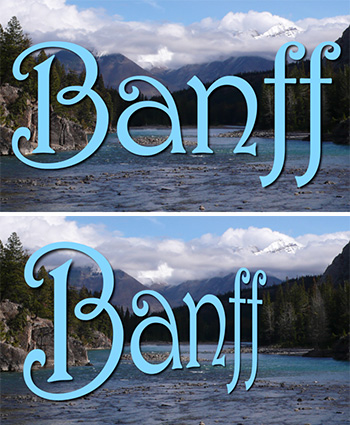
Rotating text or images on the Y-axis is a fast way to add the illusion of depth.
Square-on text (top). Text rotated 45° on the Y-axis using the Text Inspector.
An easy way to add depth to text is to rotate it on the Y-axis. (See screen shot.)
While Final Cut does not support 3D rotation of most objects, it does support 3D rotation of text.
In this screen shot, the text clip (700 point Harrington) was rotated 45° on the Y-axis in Text Inspector > Rotation.
Even better, this rotation is keyframeable, so you can animate this rotation while the rest of the clip is playing.
EXTRA CREDIT
The text size slider only goes to 300 points or so. To create larger text, enter a number in the field, rather than drag the slider.
Please rate the helpfulness of this tip.
Click on a star to rate it!
https://www.theinsidetips.com/wp-content/uploads/2019/09/Tips-Logo-700x150.jpg00Larry Jordanhttps://www.theinsidetips.com/wp-content/uploads/2019/09/Tips-Logo-700x150.jpgLarry Jordan2020-10-26 01:30:002020-10-26 01:30:00Tip #1114: A Simple Way to Add Depth to Text
A cast shadow copies the source object, colors it black, then distorts it for position.
A translucent text title with a manually-created cast shadow.
We can use the Drop Shadow effect to create a variety of shadows, but sometimes, it’s more flexible to create one manually. Here’s how.
NOTE: In this example, I’m using text, but any object that is smaller than full frame will work.
Copy the image
Colorize it black.
Add a Gaussian blur.
Lower the opacity of the shadow to, say, 70%.
Enable Video Inspector > Distort and lean the shadow back to match the angle of the background surface.
Done. Sit back and enjoy your handiwork.
EXTRA CREDIT
In the screen shot, I lowered the opacity of the foreground clip to make the shadow a bit more obvious. For most things, that would not be appropriate.
It doesn’t have to be perfect, it just needs to get the job done efficiently.
(Image courtesy of Pexels.com.)
My wife has a saying: “The perfect is the enemy of the good.” Nowhere is that more true than in technology; and it is driving us all nuts.
What this saying means is that we spend too much time looking for the perfect system, when a system that may be less than perfect is still more than adequate.
As an example, I’m in the process of upgrading my server for faster performance and greater capacity. However, last night, as I was exporting my weekly webinar, I measured how fast Final Cut creates a ProRes 4444 file: 85 MB/second. Even if I had storage that clocked in at NVMe speeds – 2500 MB/sec – my exports would not be any faster because FCP X can only calculate these files so fast.
1080p media needs less than 40 MB/second to edit, while 4K media needs less than 70 MB/sec. Storage that goes 300 MB/second will edit at the same speed as storage that goes 2500 MB/second.
I’m not saying faster storage is a bad idea, clearly, multicam editing, HDR or larger frame rates require more horsepower than simple HD. However, what I am saying is that we need to ask ourselves a bigger question: Where will extra speed actually help? For example, if I only edit one project a week, spending a lot of money improving export speed is not meaningful compared to the time it takes to edit the project in the first place. Sadly, faster storage does not help me think any faster. I wish it did.
Another example was provided by Gloria. She owns a high-end 2019 Mac Pro. She’s worried that Thunderbolt 4, which hasn’t shipped yet, will make her system obsolete.
Well, first, ALL computers become obsolete at some point, but when it comes to performance, Thunderbolt 4 is the same as Thunderbolt 3, unless you are driving several very large external monitors. And, even when new gear is released, as it always is, all our current gear will still work exactly the same as it does now.
I get dozens of emails each week from editors happily editing on Mac Pro systems that are 10-12 years old. Clearly not state of the art, but fully capable of doing the work they need to get done – on time and on budget. I get even more emails from editors stressing over whether they need a 3.2 GHz CPU or 3.3 GHz.
My advice is stop trying for perfection – unless the search itself is something you enjoy. Instead find a system that meets your needs. Most of the time, good enough is also fast enough. And “future-proofing” is a fool’s errand.
Jan Frederickson, of WLS-TV, had a sign on her wall that I think about daily: “It’s better than perfect, it’s done.”
That is a reassuringly true statement.
Please rate the helpfulness of this tip.
Click on a star to rate it!
https://www.theinsidetips.com/wp-content/uploads/2019/09/Tips-Logo-700x150.jpg00Larry Jordanhttps://www.theinsidetips.com/wp-content/uploads/2019/09/Tips-Logo-700x150.jpgLarry Jordan2020-10-23 01:30:002020-10-16 20:00:00Tip #1099: The Challenge of Perfect vs. Good
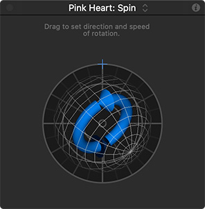
Pressing the Shift key, while dragging, constrains the axis to 45° increments.
The Spin behavior with the inner circle constrained to a 45° angle.
Spin is a very popular Behavior that gets elements in a Motion project to spin! (I know, I know, who would have guessed…?)
What you may not know is that there is a hidden keyboard shortcut that helps you make the most of this move.
Dragging the outer circle determines the direction and speed of the spin. (For example, dragging a 90° arc means that the selected element will rotate 90° over the duration of the effect.)
Dragging the inner blue circle changes the axis of the spin.
Here’s the secret: Press the Shift key while dragging that inner circle to constrain the axis to 45° increments. This makes it very easy to rotate an element exclusively on, say, the Y axis.
I use this technique frequently, for example, when I want to apply perspective to text by rotating just on the Y axis.
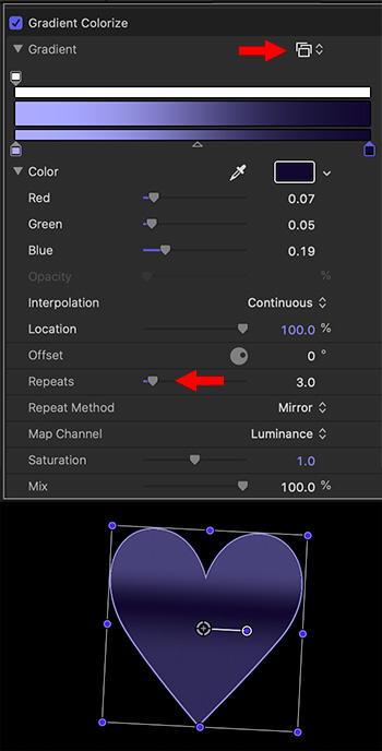
Texture and color variations improve almost every element. Gradients can help.
The gradient color options, with the results of this setting displayed below.
Coloring an element is something we do all the time. But, it is often much more interesting to color using gradients. Here’s how.
Select an element in the Layers panel. (White elements work best, but almot any color element can be used.
Apply Filters > Color > Gradient Colorize.
In Inspector > Filters > Gradient Colorize, select your own colors, or choose an existing style (menu at the top red arrow in screen shot).
Play with the lower controls and watch how they change the look of the gradient (lower red arrow in screen shot).
NOTE: If the colors in the original element interfere with the gradient, apply Filters > Color > Hue/Saturation, then remove all the saturation to convert the element to grayscale before applying the gradient.
EXTRA CREDIT
The only control missing from this effect is the ability to rotate the gradient so that it could flow from a different direction than simply the top.
Please rate the helpfulness of this tip.
Click on a star to rate it!
https://www.theinsidetips.com/wp-content/uploads/2019/09/Tips-Logo-700x150.jpg00Larry Jordanhttps://www.theinsidetips.com/wp-content/uploads/2019/09/Tips-Logo-700x150.jpgLarry Jordan2020-10-22 01:30:002020-10-16 19:37:40Tip #1095: Playful, More Effective, Colors
Share your favorite tutorial websites in the comments.
(Image courtesy of Pexels.com.)
With so many effects packages out there, and so many web sites providing tutorials, I’m curious about which tutorials or web sites you find the most helpful.
Share your favorites in the comment section below and I’ll highlight them in future Tip Letters.
Please rate the helpfulness of this tip.
Click on a star to rate it!
https://www.theinsidetips.com/wp-content/uploads/2019/09/Tips-Logo-700x150.jpg00Larry Jordanhttps://www.theinsidetips.com/wp-content/uploads/2019/09/Tips-Logo-700x150.jpgLarry Jordan2020-10-21 01:30:002020-10-16 19:24:12Tip #1106: Share Your Favorite Tutorials
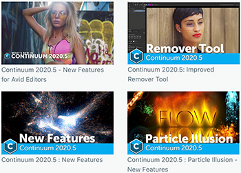
Dozens of tutorials covering all the Boris FX products.
Four of the tutorials on the Boris FX website.
I was exploring the Boris FX website and discovered a gold mine of video tutorials for 22 different host applications and spanning 23 categories, including:
https://www.theinsidetips.com/wp-content/uploads/2019/09/Tips-Logo-700x150.jpg00Larry Jordanhttps://www.theinsidetips.com/wp-content/uploads/2019/09/Tips-Logo-700x150.jpgLarry Jordan2020-10-21 01:30:002020-10-21 01:30:00Tip #1107: Boris FX Tutorials
For most projects, choose ProRes; though use H.264 where file size is critical.
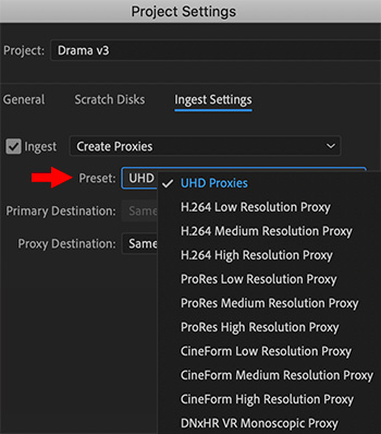
Ingest options for Media Browser, indicating the default proxy options.
Premiere continues to improve its proxy workflow, most recently by adopting the ProRes family of codecs across all apps, both Windows and Mac. When it comes to creating proxies, we can now choose between four different codecs:
H.264
ProRes
CineForm
DNxHR VR
If you want the smallest possible proxy file size, H.264 is the choice. However, this is not an efficient format to edit, especially on older computers.
My personal preference is ProRes, though CineForm is an excellent alternative.
The DNx options are specifically for 360° VR video, either monoscopic or stereo.
NOTE: Resolution refers to the frame size of the proxy file: full resolution, half resolution or quarter resolution. For most projects and rough cuts, half resolution is the best balance between file size and image quality.
EXTRA CREDIT
UHD Proxies, in case you were wondering, use ProRes Proxy at 1/4 resolution, which makes the files efficient to edit, but small in size at 960×540.
Please rate the helpfulness of this tip.
Click on a star to rate it!
https://www.theinsidetips.com/wp-content/uploads/2019/09/Tips-Logo-700x150.jpg00Larry Jordanhttps://www.theinsidetips.com/wp-content/uploads/2019/09/Tips-Logo-700x150.jpgLarry Jordan2020-10-20 01:30:002020-10-16 19:13:52Tip #1096: Select the Right Proxy Format
Shadow & Highlight Tints are quick ways to affect the dominant grayscale values in an image.
An image as captured (left) and after tints were applied. (Image courtesy of J. Putch and “Route 30, Too!“)
There’s an unlimited range of looks and emotions we can evoke with the color tools in Premiere. Here’s a technique using two tools I haven’t worked with before to boost the emotion in a scene.
In the screen shot, the image on the left is how it was shot. The image on the right was adjusted using three settings in the Lumetri Color > Creative panel:
Vibrance was decreased 30% to reduce saturation.
Shadow Tint was pushed deeply toward dark blue affecting the darker portions of the frame.
Highlight Tint was pushed slightly toward red.
Look how much more stressed and anguished she looks, just in changing these simple settings.
The benefit to using Shadow and Highlight Tints is that you can quickly alter the color balance of a scene by affecting shadows, which our eye responds to at a much deeper level than highlights.
EXTRA CREDIT
When altering saturation, Vibrance is a better tool than Saturation, because Vibrance only affects mid-tone values.
Please rate the helpfulness of this tip.
Click on a star to rate it!
https://www.theinsidetips.com/wp-content/uploads/2019/09/Tips-Logo-700x150.jpg00Larry Jordanhttps://www.theinsidetips.com/wp-content/uploads/2019/09/Tips-Logo-700x150.jpgLarry Jordan2020-10-20 01:30:002020-10-16 19:11:45Tip #1097: Creative Color Tints
If you haven’t explored the PostPerspective.com website, you are missing a treat.
Editor-in-Chief Randi Altman has a multi-decade career covering our industry. A few years ago, she founded PostPerspective.com to provide online, in-depth coverage of our industry.
Typical stories include interviews with the folks behind the camera, analysis of production and post-production techniques, equipment reviews, and tracking personnel as we move about the industry.
We may request cookies to be set on your device. We use cookies to let us know when you visit our websites, how you interact with us, to enrich your user experience, and to customize your relationship with our website.
Click on the different category headings to find out more. You can also change some of your preferences. Note that blocking some types of cookies may impact your experience on our websites and the services we are able to offer.
Essential Website Cookies
These cookies are strictly necessary to provide you with services available through our website and to use some of its features.
Because these cookies are strictly necessary to deliver the website, refuseing them will have impact how our site functions. You always can block or delete cookies by changing your browser settings and force blocking all cookies on this website. But this will always prompt you to accept/refuse cookies when revisiting our site.
We fully respect if you want to refuse cookies but to avoid asking you again and again kindly allow us to store a cookie for that. You are free to opt out any time or opt in for other cookies to get a better experience. If you refuse cookies we will remove all set cookies in our domain.
We provide you with a list of stored cookies on your computer in our domain so you can check what we stored. Due to security reasons we are not able to show or modify cookies from other domains. You can check these in your browser security settings.
Google Analytics Cookies
These cookies collect information that is used either in aggregate form to help us understand how our website is being used or how effective our marketing campaigns are, or to help us customize our website and application for you in order to enhance your experience.
If you do not want that we track your visit to our site you can disable tracking in your browser here:
Other external services
We also use different external services like Google Webfonts, Google Maps, and external Video providers. Since these providers may collect personal data like your IP address we allow you to block them here. Please be aware that this might heavily reduce the functionality and appearance of our site. Changes will take effect once you reload the page.
Google Webfont Settings:
Google Map Settings:
Google reCaptcha Settings:
Vimeo and Youtube video embeds:
Other cookies
The following cookies are also needed - You can choose if you want to allow them:
Privacy Policy
You can read about our cookies and privacy settings in detail on our Privacy Policy Page.