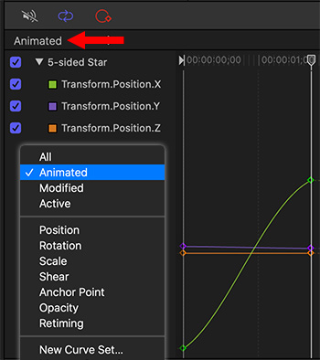
This menu is located in the top left corner of the Keyframe Editor.
The Curve menu in the top left corner of the Keyframe Editor. The pop-up menu is outlined in white.
As projects get more complex, tracking which elements are animated and how they are animated gets tricky. Fortunately, Motion has a menu option that quickly allows you to see any modified settings or keyframes applied to a selected element.
With your project open, display the Keyframe Editor (shortcut: Cmd + 8). Next, select the element with the settings you want to review.
Then, in the top left corner, click the Animated menu. Here, you have several options:
All. Shows all settings for the selected element, whether modified or note.
Animated. Settings which have keyframes applied.
Modified. Setting which were changed from their defaults, whether or not keyframes were applied.
Other options limit the settings that are displayed to minimize visual clutter.
EXTRA CREDIT
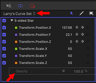
Tip #555 illustrates how to create custom curve sets, so you see exactly the settings you need.
Custom Curve Sets allow us to see just the parameters we want.
A Custom Curve Set, showing parameter settings for Position, Scale and Opacity.
This tip originally appeared as an Apple KnowledgeBase article. This is an excerpt. In Tip #550, we illustrated how to access the default curve set in Apple Motion to see which settings have been modified or animated. However, we can also create our own custom curve set.
In the screen shot, I created a new curve set, then added Position, Scale and Opacity settings to it. This allows me to see just the changes to those key settings for the selected elements for the duration of the Motion project.
In addition to using the built-in curve set views, you can make and manage your own view using the last two options in the Show Curve Set pop-up menu: New Curve Set and Manage Curve Sets. As you create and store custom parameter sets, they appear in the Show Curve Set pop-up menu (at the top of the parameter list in the Keyframe Editor), allowing you to switch between them. Deleting, duplicating, and modifying custom sets is done in the Manage Curve Sets dialog (accessible from the Show Curve Set pop-up menu).
To create a custom curve set:
In the Keyframe Editor in Motion, click the Show Curve Set pop-up menu, then choose New Curve Set.
In the dialog that appears, enter a name for the set, then click OK.
After you create a curve set, you can choose it from the Show Curve Set pop-up menu.
To add parameters to a custom curve set do one of the following:
After you create a custom curve set, drag a parameter name from any pane in the Inspector into the Keyframe Editor parameter list.
In the Inspector, click the Animation menu for the parameter, then choose Show in Keyframe Editor.
The Animation menu (a down arrow) remains hidden until you position the pointer over the far-right side of the parameter row you want to modify.
The parameter is added to the custom curve set.
To remove a parameter, drag it out of the list.
EXTRA CREDIT
To delete, duplicate or manage the display order of custom curve sets, select Manage Curve Sets from the Cuve menu.
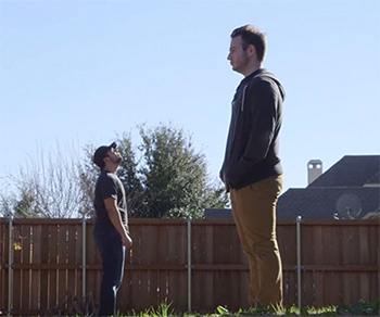
Some very cool effects are very easy to do in-camera.
This is an example of forced perspective.
This article, written by Ryan Connolly at Film Riot, first appeared in PremiumBeat.com. This is an excerpt. Here are five easy in-camera effects you can do yourself.
1. Forced Perspective
Forced perspective is a technique that uses spacing and distance to make objects appear larger or smaller in relation to other objects.
2. Lower Shutter Speed
Using a lower shutter speed is generally done for two reasons. The first: because the location is dark and you need to let in more light. The second is to create motion blur to make the action seem more fluid.
3. Faster Shutter Speed
A faster shutter speed is utilized extensively by professional sport filmmakers. Because of the high shutter speed, you can essentially “freeze” a moment. When using this in conjunction with camera movement, the action seemingly becomes more violent. This technique works great in combat sequences.
4. Lens Whacking
Lens whacking is done by detaching the lens from the mount and then holding it close enough to allow the sensor to still gain an image. The result is very surreal and ethereal.
5. Lens Flare
Lens flare is the natural effect of non-image forming light entering the lens and hitting the sensor, creating the characteristic streak of light.
EXTRA CREDIT
Visit the link at the top of this tip to see a video illustrating all these techniques.
Line Boil used to be considered a mistake. Now, it’s a way to add life to animation.
The PremiumBeat folks posted a YouTube video illustrating how to create a line boil animation.
“Line boil” animation is where lines in an animated figure shiver, or “boil,”” as though every frame was drawn by hand. It gives life and energy to a line drawing by emphasizing rough edges.
Here are the steps:
Using any drawing tool you prefer, create an original image. Line drawings of geometric shapes work best.
Trace the original image by hand, or mouse, create 4 or 5 new images – either as layers or separate images, depending upon the software you are using.
NOTE: It is important that these different iterations not look the same. It’s the variations between them that adds life to the animation.
Loop playback of these frames and watch your simple line drawing come to life.
EXTRA CREDIT
Watch the video linked above to see an illustration of this technique.
Please rate the helpfulness of this tip.
Click on a star to rate it!
https://www.theinsidetips.com/wp-content/uploads/2019/09/Tips-Logo-700x150.jpg00Larry Jordanhttps://www.theinsidetips.com/wp-content/uploads/2019/09/Tips-Logo-700x150.jpgLarry Jordan2020-03-18 01:30:002020-03-14 12:37:33Tip #509: How to Create Line Boil Animation
For several years, I ran the “Creative Truths Contest.” This invited readers to send in aphorisms that best represent the editing process. As you might imagine, editors took a pretty dim view of, well, just about everything.
Here are five of my favorites, along with the name of the editor that contributed it to the contest.
No one knows what you do but they always know that “it won’t take long.” (Jeff Fulton )
Every new technology opens a whole new world of things that can go wrong. (Will Schwarz)
As a dedicated production professional, I sit in dark places and wait for bad things to happen. (Mark Triplett)
Got a client you haven’t heard from in months or a year? Erase their old project files and media, and you are guaranteed a phone call or email from them within 24 hours, wanting a re-edit. (Mark Suszko)
Needed Lead EDITOR: Must have at least 5 years of experience. No out of college applicants will be excepted. Must be expert in Adobe Premier, Photoshop, and After Effects. We will ONLY look at candidates that are capable of shooting with a pro camera, setting up lighting, and recording live audio. You must have a deep understanding in DaVinci Resolve and Cinema 4D. This is an ENTRY LEVEL POSITION. (Hector Pina)
Creativity can’t be forced – but it can be encouraged.
Creativity is seeing the same things in a different way.
This article, written by photographer Jamie Windsor, first appeared in PetaPlxel.com. This is a summary of what he wrote. (This link also includes an interesting 8-minute video discussing this problem.)
“I worked out that creative block happens for me when my conscious mind falls out of sync with my intuition. What I mean by this is that when I’m creating something, my intuition (or my subconscious mind) is coming up with ideas and my conscious mind is forming it into something coherent.
“But when I get into a creative rut, it’s like my subconscious mind’s engine has stalled and my conscious mind is left trying to run things. The problem with this is [that] my conscious mind can only see what it can immediately access and that can impact my creativity and my motivation.””
Here are five tips Jamie Windsor uses to restart his creative engine:
Stop Trying
Change Location
See Other People
Stop Worrying
Give Up on Bad Ideas
Please rate the helpfulness of this tip.
Click on a star to rate it!
https://www.theinsidetips.com/wp-content/uploads/2019/09/Tips-Logo-700x150.jpg00Larry Jordanhttps://www.theinsidetips.com/wp-content/uploads/2019/09/Tips-Logo-700x150.jpgLarry Jordan2020-03-06 01:30:002020-03-06 01:30:00Tip #478: Break Out of a Creative Rut
The Cellular generator with a Slit Scan effect applied.
Here’s a very cool way to create a time-warp effect. I’ve never used this in real-life, but I teach it in all of my Motion classes, because it is fun to play with and teaches an important lesson. Here are the steps.
In Motion, add Generators > Cellular into a project.
Change the color gradient from black to white, to medium-dark blue to black.
Select Cellular in the Layers panel and apply Filters > Stylize > Slit Scan.
In Inspector > Properties, rotate the group so the blue flares radiate up-left.
In Inspector > Filters:
Change Center so the white line is in a lower corner
Change Speed to 15.
Change the Glow color to a radioactive green.
Then, change anything else you want.
The lesson this teaches is that we can take something very “blah” and make it eye-catching simply by using a few filters.
EXTRA CREDIT
What what happens when you replace Slit Scan with Slit Tunnel.
Please rate the helpfulness of this tip.
Click on a star to rate it!
https://www.theinsidetips.com/wp-content/uploads/2019/09/Tips-Logo-700x150.jpg00Larry Jordanhttps://www.theinsidetips.com/wp-content/uploads/2019/09/Tips-Logo-700x150.jpgLarry Jordan2020-03-05 01:30:002020-03-05 01:30:00Tip #496: A Very Cool Time-Warp Effect
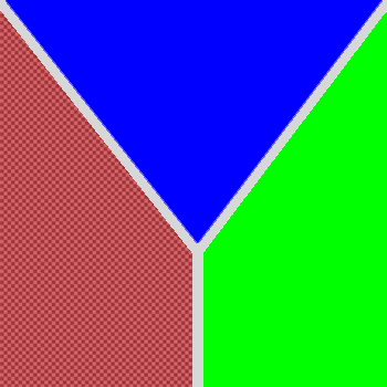
The only requirement for a chroma-key is that the background color not be used in the foreground.
In this illustration, the color red is translucent, because we are using it as the key color.
Green-screen is shorthand for a “chroma-key,” that is a key based upon a color. We remove a background by making all the pixels of a certain color transparent so we can put something else in its place. However, a “green-screen key” doesn’t, in fact, require anything green. It’s just that, when people are involved, we use green more than any other color. In the past, video used blue backgrounds, while film used green, simply due to how video and film responded to the two different colors.
Over time, we standardized on green because it is a color that is not in human skin tone and, while many of us like wearing varying shades of blue, green is much more rare in clothing.
NOTE: However, if you are creating a key to recreate a night scene, you are better off using a blue background, because moonlight is very blue and the edges of the key will fit in better with the night look.
What a chroma key does is look at the color of each pixel. If it finds one that matches the color you want to remove, it makes that pixel transparent. The key color could be green for people, red for lizards or blue for, say, an agricultural spot set in a cornfield.
There’s no magic that determines which color you use – any modern keyer can key on any color. Pick the one that works the best for your project. (Like the red backgrounds I saw used for “The Lizard King from Outer Space.” Very, very weird.)
Please rate the helpfulness of this tip.
Click on a star to rate it!
https://www.theinsidetips.com/wp-content/uploads/2019/09/Tips-Logo-700x150.jpg00Larry Jordanhttps://www.theinsidetips.com/wp-content/uploads/2019/09/Tips-Logo-700x150.jpgLarry Jordan2020-03-04 01:30:002020-03-04 01:30:00Tip #500: When is a Green-Screen Key Red?
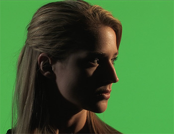
Light the background for evenness. Light the foreground for drama.
Here, Lisa is lit for drama, while the background is lit evenly.
One of the challenges that new cinematographers face in lighting green-screen shots is that there is almost no correlation between the lighting of the background versus the foreground. In fact, they should be lit separately. Here’s why.
Lisa, in this screen shot, is an excellent example.
The background is a highly-saturated green because the key needs color, not just brightness, to work. As well, the background is very evenly lit and, if you looked at it on the Waveform Monitor, it would be right at 50% grayscale. (This is because 50% gray is the optimum value for maximizing color saturation.)
But, Lisa, herself, is very dark. This is because it is a very dramatic scene and it needs to be dark. It could, in fact, be a silhouette. There is NO correlation between how you light the foreground from the background.
One other important point to keep in mind: To minimize spill from the green background hitting the shoulders and hair of the foreground talent, try to keep talent ten feet or more in front of the green background. (In this screen shot, Lisa was 12 feet in front of the background.)
Please rate the helpfulness of this tip.
Click on a star to rate it!
https://www.theinsidetips.com/wp-content/uploads/2019/09/Tips-Logo-700x150.jpg00Larry Jordanhttps://www.theinsidetips.com/wp-content/uploads/2019/09/Tips-Logo-700x150.jpgLarry Jordan2020-03-04 01:30:002020-03-04 01:30:00Tip #501: Lighting for Green-Screen
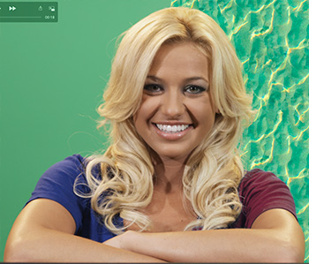
Texture comes from gray-scale. We can change hue, but not brightness.
This is Brittney. She’s one of the models from the now-defunct GlamourKey.com website. She’s wearing a deep blue shirt. Except, the script called for her to wear burgundy. Or maybe light pink, it was a toss-up…
The problem is that when we are changing the color of something in post, we can change it’s hue or saturation, but we can’t change it’s gray-scale. Why? Because variations in gray-scale provide objects their texture. If I replace both color and gray-scale her shirt, which has nice folds in the sleeves, suddenly become a block of solid, undistinguished color.
NOTE: To prove the point about texture, the background behind Brittney on the left has a single gray-scale value: 50%. The background behind her on the right, has gray-scale values that range from 0 to 100.
So, in Brittney’s case, I can replace dark blue with dark green, or dark red, but not light pink, because I can’t change the gray-scale values enough in her shirt to create light pink from burgundy.
Please rate the helpfulness of this tip.
Click on a star to rate it!
https://www.theinsidetips.com/wp-content/uploads/2019/09/Tips-Logo-700x150.jpg00Larry Jordanhttps://www.theinsidetips.com/wp-content/uploads/2019/09/Tips-Logo-700x150.jpgLarry Jordan2020-03-04 01:30:002020-03-04 01:30:00Tip #502: The Challenges of Changing a Color
We may request cookies to be set on your device. We use cookies to let us know when you visit our websites, how you interact with us, to enrich your user experience, and to customize your relationship with our website.
Click on the different category headings to find out more. You can also change some of your preferences. Note that blocking some types of cookies may impact your experience on our websites and the services we are able to offer.
Essential Website Cookies
These cookies are strictly necessary to provide you with services available through our website and to use some of its features.
Because these cookies are strictly necessary to deliver the website, refuseing them will have impact how our site functions. You always can block or delete cookies by changing your browser settings and force blocking all cookies on this website. But this will always prompt you to accept/refuse cookies when revisiting our site.
We fully respect if you want to refuse cookies but to avoid asking you again and again kindly allow us to store a cookie for that. You are free to opt out any time or opt in for other cookies to get a better experience. If you refuse cookies we will remove all set cookies in our domain.
We provide you with a list of stored cookies on your computer in our domain so you can check what we stored. Due to security reasons we are not able to show or modify cookies from other domains. You can check these in your browser security settings.
Google Analytics Cookies
These cookies collect information that is used either in aggregate form to help us understand how our website is being used or how effective our marketing campaigns are, or to help us customize our website and application for you in order to enhance your experience.
If you do not want that we track your visit to our site you can disable tracking in your browser here:
Other external services
We also use different external services like Google Webfonts, Google Maps, and external Video providers. Since these providers may collect personal data like your IP address we allow you to block them here. Please be aware that this might heavily reduce the functionality and appearance of our site. Changes will take effect once you reload the page.
Google Webfont Settings:
Google Map Settings:
Google reCaptcha Settings:
Vimeo and Youtube video embeds:
Other cookies
The following cookies are also needed - You can choose if you want to allow them:
Privacy Policy
You can read about our cookies and privacy settings in detail on our Privacy Policy Page.