… for Visual Effects

Tip #655: Control Keyframe Speed

Larry Jordan – LarryJordan.com

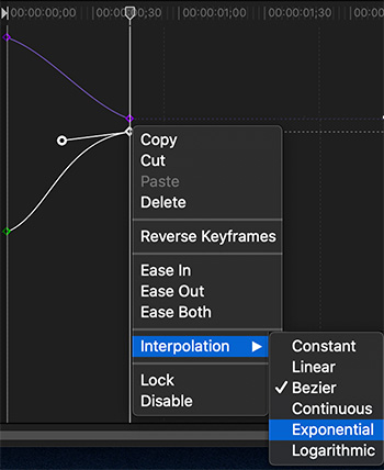
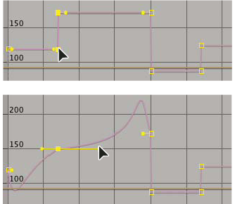
Keyframe speed is determined by distance and interpolation.

Image courtesy Adobe Systems, Inc.
Linear Interpolation (top) has sharp corners. Bezier interpolation has curves.

Topic $TipTopic

In After Effects, when you animate a property in the Graph Editor, you can view and adjust the rate of change (speed) of the property in the speed graph.

The following factors affect the speed at which a property value changes:

  • The time difference between keyframes in the Timeline panel. The shorter the time interval between keyframes, the more quickly the layer has to change to reach the next keyframe value. If the interval is longer, the layer changes more slowly, because it must make the change over a longer period of time. You can adjust the rate of change by moving keyframes forward or backward along the timeline.
  • The difference between the values of adjacent keyframes. A large difference between keyframe values, such as the difference between 75% and 20% opacity, creates a faster rate of change than a smaller difference, such as the difference between 30% and 20% opacity. You can adjust the rate of change by increasing or decreasing the value of a layer property at a keyframe.
  • The interpolation type applied for a keyframe. For example, it is difficult to make a value change smoothly through a keyframe when the keyframe is set to Linear interpolation, but you can switch to Bezier interpolation at any time, which provides a smooth change through a keyframe. If you use Bezier interpolation, you can adjust the rate of change even more precisely using direction handles.

EXTRA CREDIT

Here’s an Adobe Help article to learn more.


Please rate the helpfulness of this tip.

Click on a star to rate it!

… for Visual Effects

Tip #656: Keyframe Interpolation Tips

Larry Jordan – LarryJordan.com

Interpolation is the process of estimating unknown values that fall between known values.

The interpolation settings in Apple Motion. Adobe After Effects is similar.

Topic $TipTopic

Interpolation is the process of estimating unknown values that fall between known values. The key phrase is: “between two known values.” (By comparison, extrapolation attempts to figure out where a line is going outside of a set of known points.)

Interpolation is at the heart of keyframe animation. We set a starting point and an ending point, then the software calculates all the points in the middle. What the interpolation settings determine is how those points are calculated.

Because interpolation generates the property values between keyframes, interpolation is sometimes called tweening. Interpolation between keyframes can be used to animate movement, effects, audio levels, image adjustments, transparency, color changes, and many other visual and audio elements.

Temporal interpolation is the interpolation of values in time; spatial interpolation is the interpolation of values in space. Some properties—such as Opacity—have only a temporal component. Other properties—such as Position—also have spatial components.

  • Constant: When applied to a keyframe or curve segment, this method holds the keyframe at its current value and then abruptly changes to the new value at the next keyframe.
  • Linear: When applied to a keyframe, this method creates a uniform distribution of values through the keyframe from its two adjacent keyframes. When applied to a segment, this method creates uniform distribution of values between points.
  • Bezier: This method lets you manipulate the keyframe curve manually by dragging the tangent handles. If multiple Bezier keyframes are selected, or Bezier interpolation is applied to the curve segment, the handles of all selected keyframes are modified.
  • Continuous: This method behaves like Bezier interpolation, but without access to the tangent handles (which are calculated automatically).
  • Exponential: This method creates an exponential curve between the current keyframe and the next, changing the value slowly at first, then reaching its maximum rate of acceleration as it approaches the next keyframe.
  • Logarithmic: This method creates a logarithmic curve between the current keyframe and the next, changing the value rapidly at first, then slowing drastically as it approaches the next keyframe.

EXTRA CREDIT

Here’s an Apple Support article to learn more.


Please rate the helpfulness of this tip.

Click on a star to rate it!

… for Visual Effects

Tip #632: Crop vs. Trim: What’s the Difference?

Larry Jordan – LarryJordan.com

The difference is what happens to the original frame size.

The Crop vs. Trim options in Apple Final Cut Pro X.

Topic $TipTopic

It’s a simple thing that confuses a lot of people: What’s the difference between crop and trim?

Well, first, they have a lot in common:

  • Both remove portions of the image.
  • Both use rectangles to work their magic
  • Both allow us to concentrate the viewer’s eye on a certain part of the image.

The big difference is that crop always reduces the image size to match the cropped area, while trim does not alter the image size.

EXTRA CREDIT

If you trim an image on the lowest layer, you’ll create black areas for the removed portions of the original image.

Generally, trimming is used for elements on higher layers/tracks, while cropping is used for the lowest layer/track/background.


Please rate the helpfulness of this tip.

Click on a star to rate it!

… for Visual Effects

Tip #633: Storyboarding Visual Effects

Larry Jordan – LarryJordan.com

Storyboards and production design are integral to all visual effects.

Doubling – a split-screen effect. (Image courtesy of StoryboardThat.com)

Topic $TipTopic

This tip, written by visual effects artist, Miguel Cima, first appeared in StoryboardThat.com. This is a summary.

From the very beginning of the creative process, imagination is in play. Before a thing exists, it must be visualized in the mind. This happens in filmmaking all along the way. First the screenplay must be written, a necessary text exercise which does not allow for initial images. Then comes the storyboard. At this point, the first spark of what lies inside the artist’s mind comes to life.

Deep into film’s history, various techniques have been employed to insert imagery which was not filmed on set with things which were. Regardless of how special visual effects are accomplished, one central challenge has always been consistently presented to filmmakers: how can a scene be filmed when much of it cannot be seen at all? Here are some of the more common visual effects used in live action feature films, and how the filmmaker can approach mastering the art of “see you later.”

  • Animation. The good news for the filmmakers is that a well-crafted storyboard will serve as a guide in pre-production to get cast and crew familiar with the idea of what the final frames and sequences will look like. When combined with character illustrations and production design renderings, a full picture can be grasped to help translate not only the action, but the mood of what will be added in later.
  • Miniatures. One of the oldest tricks in the special visual effects book is the use of miniatures. Traditionally, this meant building scale models of environments to represent very large sets like entire cities, massive vehicles, huge structures, and so forth.
  • Matte Paintings. Another time-honored method to add large-scale environments is the Matte Painting. There’s a few different ways to do it, but essentially, an artist paints a highly detailed photo-realistic set piece, often on a massive scale, to depict what a set could not.
  • Stop Motion. There’s a certain charm to stop motion animation, even if the final product cannot mask what it is. From old classics like King Kong to 2015’s Oscar-Nominated Anomalisa, there’s a texture to exposing fully posable models one frame at a time that CGI can never recreate.
  • Doubling. Everybody seems to love twins. And clones. Whatever the case, every time you see a double of a character on screen, it is almost invariably the technique of doubling which you are watching (as opposed to using real-life twins, triplets, etc.). But as always, doing early tests with the tech on hand can do an even better job on performance prep.

EXTRA CREDIT

The article itself, as well as the illustrations, are a fun, easy read.


Please rate the helpfulness of this tip.

Click on a star to rate it!

… for Visual Effects

Tip #634: Three Easy Recipes for Fake Blood

Larry Jordan – LarryJordan.com

Fake blood stains easily. Be careful of your clothes.

Image courtesy of Raindance.com.
Nothing like blood everywhere to add, uh, impact.

Topic $TipTopic

This tip originally appeared in Raindance.com article. This is an excerpt.

We all gotta die sometime – however most actors prefer that it not happen on camera. For those situations, we need FAKE BLOOD! Here are three recipes.

Corn Syrup Blood

This is the recipe that pretty much everyone uses, and there’s a lot of variations so feel free to experiment.

  • 16 oz. White corn syrup (Karo syrup – this is a US product, but adding golden syrup does the job just as well, alternatively just mix sugar and water and reduce on the stove until it becomes syrupy)
  • 1 oz. red food coloring
  • 1 oz. washing detergent
  • 1 oz. water

Options: Add a drop of blue food coloring to create a more realistic color. Remove the detergent if you want to make edible blood. Adding condensed milk makes it less transparent and more like real blood.

The blood is extremely sticky and can stain skin and clothes so makes sure it’s washed off quickly and have stain remover handy for clothes!

Jelly Blood

Microwave 3-4 bottles of glycerin then add one cube of strawberry jelly and mix until dissolved. Then add a small amount of gelatine (1/5 of a packet) and then add red food colouring to desired effect. Keep stirring until mixed well. It is slightly runny but great for that Reservoir Dogs look in the back seat of the car. All ingredients are easily found in supermarkets.

Black and White Blood

Take a tip from the old school and use opaque chocolate syrup as used by Alfred Hitchcock in Psycho. Tastes delicious as well!


Please rate the helpfulness of this tip.

Click on a star to rate it!

… for Visual Effects

Tip #607: Autodesk Flame & Smoke Shortcuts

Larry Jordan – LarryJordan.com

A searchable list of Flame and Smoke Classic Shortcuts

The Flame logo.

Topic $TipTopic

Autodesk published a searchable list of keyboard shortcuts for both Flame and Smoke, organized by function.

You can find them here.


Please rate the helpfulness of this tip.

Click on a star to rate it!

… for Visual Effects

Tip #614: What is the Alpha Channel

Larry Jordan – LarryJordan.com

Alpha channels allow us to combine multiple images into a new single image.

Topic $TipTopic

An alpha channel is essentially any channel other than the channels that define color values for pixels in an image. In graphics, the alpha channel is the part of the data for each pixel that is reserved for transparency information. 32-bit graphics systems contain four channels — three 8-bit channels for red, green, and blue (RGB) and one 8-bit alpha channel.

NOTE: 8-bit color channels means that each channel can display up to 256 shades of that color.

The alpha channel is really a mask. It specifies how the pixel’s colors should be merged with another pixel when the two are overlaid, one on top of the other. In a 2D pixel which stores a color for each pixel, additional data is stored in the alpha channel with a value ranging from 0 to 1. A value of 0 means that the pixel is transparent while a value of 1 means the pixel is fully opaque.

Typically, alpha channels are defined per object. Different parts of the object would have different levels of transparency depending on how much you wanted the background to show through. This allows you to create rectangular objects that appear as if they are irregular in shape — you define the rectangular edges as transparent so that the background shows through. This is especially important for animation, where the background changes from one frame to the next.

Rendering overlapping objects that include an alpha value is called alpha blending. Blend modes provide a variety of ways to do this alpha blending.

EXTRA CREDIT

The concept of an alpha channel was introduced by Alvy Ray Smith in the late 1970s and fully developed in a 1984 paper by Thomas Porter and Tom Duff.


Please rate the helpfulness of this tip.

Click on a star to rate it!

… for Visual Effects

Tip #615: Node vs Layer Compositing

Larry Jordan – LarryJordan.com

Nodes scale better, while layers are faster.

Topic $TipTopic

There are two radically different digital compositing workflows: node-based compositing and layer-based compositing.

Node-based compositing represents an entire composite as a procedural map, intuitively laying out the progression from source input to final output. (This is, in fact, the way all compositing applications internally handle composites.)

Node-based compositing interface allows great flexibility, including the ability to modify the parameters of an earlier image processing step “in context” (while viewing the final composite). Node-based compositing packages often handle keyframing and time effects poorly, as their workflow does not stem directly from a timeline, as do layer-based compositing packages. Software which incorporates a node based interface include Natron, Blender, Blackmagic Fusion, and The Foundry’s Nuke.

Layer-based compositing represents each media object in a composite as a separate layer within a timeline, each with its own time bounds, effects, and keyframes. All the layers are stacked, one above the next, in any desired order; with the bottom layer usually rendered as a base in the finished image.

Layer-based compositing is very well suited for rapid 2D and limited 3D effects such as in motion graphics, but becomes awkward for more complex composites entailing numerous layers.

Nodes or Layers: Which is better?

To be honest, there is no right or wrong answer. They both can achieve the same effects. Software preference will factor greatly into your decision. The more that you use one software type, the more you will become accustomed to that system. Just remember that layers are not great for huge projects with many items and effects; likewise, projects with little footage and few effects are sometimes not the most efficient for nodes. What it really boils down to is personal preference. A great rule of thumb is go big and go nodes or keep it small and stick with layers.

EXTRA CREDIT

Here’s a nice article, written by Wéland Bourne, explaining the differences between these two systems and comparing different effects software.


Please rate the helpfulness of this tip.

Click on a star to rate it!

… for Visual Effects

Tip #592: Make Zooms More Interesting

Larry Jordan – LarryJordan.com

The Anchor Point affects both scale and rotation effects.

Image courtesy: Ed Greene and Greene HD Productions (www.greenehdtv.com/)
In Premiere, slide the circle (red arrow) to move the anchor point.

Topic $TipTopic

All of us a familiar with how scaling works: as you scale an image it gets larger or smaller. But, there’s a little known setting you can tweak that will make your zooms or rotations much more interesting.

The Anchor Point, which exists in both Premiere and Final Cut, is the point in an image which determines the center of rotation and/or scaling.

By default, both programs put the Anchor Point in the center of the frame. But, you can modify the point, which changes how an image rotates and/or scales.

  • To adjust this in Premiere (screen shot) select a clip, in Effects Control click the word “Motion” to enable on-screen controls, then slide the circle. (See screen shot.)
  • To adjust the anchor point in Final Cut, select a clip and go to Transform in the Video Inspector.

Please rate the helpfulness of this tip.

Click on a star to rate it!

… for Visual Effects

Tip #593: Opacity vs. Levels to Darken

Larry Jordan – LarryJordan.com

Lower highlights to “dim” a background, rather than opacity.

Image courtesy of 2ReelGuys.com.
The problem with lowering opacity (left)to dim an image is that the background will show through. Instead adjust levels (right).

Topic $TipTopic

Backgrounds are wonderful, especially for info-graphics. But, all too often, they are too bright. (Especially backgrounds from Apple.) We can “dim” them using opacity – but that isn’t a good idea.

What opacity does is “darken” an image by making it translucent. Since the default background in most NLEs is black, lowering opacity gives the illusion of darkening. However, as you can see from the left side of the screen shot, if there is anything in the background, it will show through. Which kinda spoils the dimming effect.

Instead, use the color grading controls in your NLE and lower highlights about 50% (right image). This darkens a background without creating translucency, or altering colors.

EXTRA CREDIT

In Photoshop, use Image > Adjustments > Levels to achieve similar results.


Please rate the helpfulness of this tip.

Click on a star to rate it!