Tip #1564: Premiere Pro’s Color Management
… for Codecs & Media
Tip #1564: Premiere Pro’s Color Management
Larry Jordan – LarryJordan.com
Colors shift, especially with different playback platforms.

This article, written by Oliver Peters, first appeared in ProVideoCoalition.com. This is a summary.
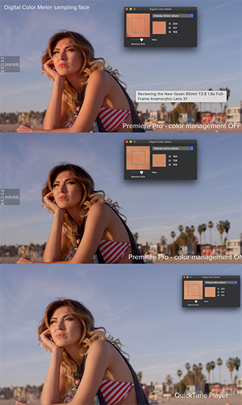
Read through any of the online forums and you’ll often see this common concern: “Why doesn’t my export look the same in QuickTime as it does in Premiere Pro?” This tends to be more common with Mac users than PC users, but it happens with Windows, too. The underlying assumption that they should match is a fallacy and Oliver explains why in this article.
Let’s start with displays. If you line up a CRT monitor, an older flat-panel plasma, and newer LCD, LED, and OLED displays, then you would be very hard-pressed to get the same image to match identically across all displays, even with calibration.
The world of Apple displays.If you are working on a newer Apple iMac, iMac Pro, or Pro Display XDR, then you are using an image system calibrated for a different display profile. iMacs use the P3 D-65 color standard with the ability to go up to 500 nits of brightness. The only consistent reference you will ever have is how the image appears through AJA or Blackmagic i/o hardware to a reference display.
Adobe Premiere Pro’s working color space. SDR sequences in Premiere Pro are designed to use Rec 709, 2.4 gamma as the working color space for the timeline and viewer. There’s a preference toggle for display color management to compensate for the interface display that you are using.
Solving the problem? My recommendation is to turn display color management ON in the Premiere Pro preferences. This gives you a proper visual match between the timeline and the output to a reference display. Unfortunately this leaves you with the dilemma of the exported file. The simplest answer is to first export a “standard” file for broadcast use. Then add an adjustment layer to your Premiere Pro sequence and apply a Lumetri effect to it. Increase saturation and lower shadows slightly. Test to taste.
But, if we are posting to the web, social platforms make additional changes to our color that are beyond our control.
Leave a Reply
Want to join the discussion?Feel free to contribute!