… for Random Weirdness

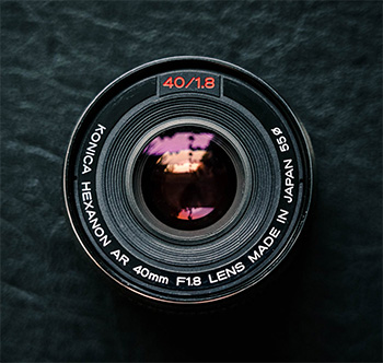
Tip #477: How to Test the Lenses You Buy

Larry Jordan – LarryJordan.com

It is better to test your lens than find a problem during a shoot.

(Image courtesy of pexels.com)

Topic $TipTopic

The team at PetaPixel and Michael the Maven have an interesting article and YouTube video on the importance of testing your lenses. Here’s the link. This is an excerpt.

You may not be aware that no two lenses are exactly the same. Why? Sample variation. Performance can vary widely from edge to edge or from wide to tight.

Here’s a quick way to test your lenses: Set your camera on a tripod in front of a flat, textured surface like a brick wall and snap photos at various apertures: wide open, f/2.8, f/4 and f/8. Feel free to add in f/5.6 if you’re feeling comprehensive. If you’re testing a zoom lens, we recommend repeating this process at various focal lengths as well.

Try to get the sensor as parallel to the wall as possible, and inspect each photo from the center out to the edges. It should be immediately obvious if you have a really bad lens at any particular focal length.

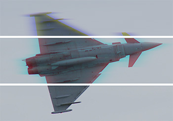
Then, as a bonus test, shoot some power lines against a blue sky and see if the lens is producing any dramatic chromatic aberration, which will show up as color fringing at the high-contrast edges between the black wires and the blue sky.


Please rate the helpfulness of this tip.

Click on a star to rate it!

… for Random Weirdness

Tip #473: 3 Tips for Perfect Exposures

Larry Jordan – LarryJordan.com

Don’t let the camera think for you; let it enable you, instead.

(Image courtesy of pexels.com.)

Topic $TipTopic

This article first appeared in PetaPixel.com. This is an excerpt.

One of the first things beginning photographers learn is the relationship between ISO, aperture and shutter speed. Known as the “exposure triangle,” this is the basis of the photography world. Here is a short summary of how each component affects your image:

  • ISO: The sensitivity of a film, or the base sensitivity (and gain) of a digital camera sensor.
  • Aperture: The opening of a lens used to control the amount of light necessary to expose the sensor/film; in addition, the aperture is used creatively to control the compositional use of depth of field.
  • Shutter Speed: The length of time of an exposure, usually measured in fractions of a second and sometimes in whole seconds.

Locate your Camera LCD Brightness setting in your menu. Most cameras are set to ‘Auto’ LCD brightness to adapt to the ambient light around you. Setting the brightness manually gives you a more reliable way to judge what you see.

Locate your Highlight Alert function in your camera’s menu system. Highlight alerts are a flashing overlay that can be enabled to alert you when you’ve blown-out highlights and lost that information. This means that if you take a photograph with portions of it so bright that no detail is recorded at all, the portions with the missing detail will flash on the screen.

Locate your Picture Style settings in your camera’s menu system. Your camera will likely default to the ‘Auto’ option and we don’t want that, in fact, none of these picture styles are ideal so we are going to make our own User Setting. You want to make this custom picture style as flat and neutral as possible. I’ve turned the Contrast, Sharpness, and Saturation all the way down to keep the image looking as flat as possible to retain all the information in your image.


Please rate the helpfulness of this tip.

Click on a star to rate it!

… for Random Weirdness

Tip #462: Lighting Day for Night

Larry Jordan – LarryJordan.com

Day-for-night scenes require thinking about the quality of moonlight.

(Image courtesy of pexels.com.)

Topic $TipTopic

This article, written by Tanner Shinnick, first appeared in PremiumBeat.com. This is an excerpt.

Day for night interiors can be tough. However, with the right approach, you can sell the effect by controlling, shaping, and cutting out the daylight.

We always hear about day for night exteriors but hardly ever day for night interiors. The first thing to understand when lighting any type of night scene is your main light source — in this case, it’s the moon. You’ll also have many practical sources in the room. However, to give a little lift to the scene, you’ll still want to push some moonlight through a window.

Many people think that the moon is a soft source because it is dim. However, the moon is actually a hard source and casts a hard shadow.

When lighting a night scene, interior or exterior, it’s always wise to rely on your harder light sources like your pars or spotted fresnels. Using these sources, you can easily imitate the quality of light of the moon and create those harsh shadows.

Also, be sure to avoid rooms with white walls. Once you start pushing in your moonlight, the white walls will behave like giant reflectors and start pushing your light in all sorts of directions. From that point, it will be difficult to sell the night effect.

Exposure is a key component when filming any night scene. To really sell the effect, it is wise to underexpose your subject by 2-3 stops. Creating this darkness for the subject will create an evening effect.

Color temperature plays a huge role in selling the effect of moonlight in a night scene. Moonlight is a very blue light source.


Please rate the helpfulness of this tip.

Click on a star to rate it!

… for Apple Motion

Tip #486: Add Drop Shadows to Text

Larry Jordan – LarryJordan.com

The secret to adding drop shadows is to add them to the group.

To add drop shadows, you apply them to the group, not the text, when blend modes are involved.

Topic $TipTopic

In Tip #475, I showed how to fill text with an animated background. In Tip #484, I showed how to put a background behind the filled text. Now, I want to show how to put a drop shadow on the text, because you can’t do it on the text itself.

Fill the Text

  • Add text into a group.
  • In the same group, put a background below the text that you want to fill the text.
  • Change the Blend Mode for the text to Stencil Alpha.

Add the Background

  • Create a new group and put it below the group containing the text.
  • Put the background you want to put behind the text effect into this second group.
  • Change the Blend Mode of the top group to Normal.

Add the Drop Shadows

  • Select the group that contains the text.
  • Go to Inspector > Properties, then enable and modify the drop shadow settings.

NOTE: If you try to apply a drop shadow to the text, it will disappear as soon as you change the blend mode.

EXTRA CREDIT

The screen shot shows the Inspector settings, plus the finished effect.


Please rate the helpfulness of this tip.

Click on a star to rate it!

… for Apple Motion

Tip #484: Put a Background Behind Filled Text

Larry Jordan – LarryJordan.com

The key is to change the blend mode of the group, not the text.

Switching the blend mode to “Normal” displays what’s behind a group.

Topic $TipTopic

In Tip #475, I illustrated how to fill text with an animated video. But, if you try to put a background behind that filled text, all you get is black. Here’s how to solve this dilemma.

Fill the Text

  • Add text into a group.
  • In the same group, put a background below the text that you want to fill the text.
  • Change the Blend Mode for the text to Stencil Alpha.

Add the Background

  • Create a new group and put it below the group containing the text.
  • Put the background you want to put behind the text effect into this second group.
  • Change the Blend Mode of the top group to Normal.

NOTE: In this last step, you are changing the Blend mode for the group, not the text inside the group.

EXTRA CREDIT

The screen shot shows the Inspector settings to create this effect. I then added the final effect so you could see it. The text is Kraash Black, the background inside the text is Two Color Ray, the blue background is Sudden Impression. All are found in the the Motion Library.


Please rate the helpfulness of this tip.

Click on a star to rate it!

… for Apple Motion

Tip #475: Fill Text with Video

Larry Jordan – LarryJordan.com

The secret is Stencil Alpha.

Property settings inside the Inspector put video inside text.

Topic $TipTopic

Text with animated video inside it is always fun to watch. Motion makes it easy to fill any text with any background. Here’s how:

  • Create and format your text. Thicker letters make this effect more visible.
  • Put the background you want to fill the text with in the same group, but behind the text.
  • Select the text and go to Inspector > Properties and change the Blend Mode to Stencil Alpha.

Done.

EXTRA CREDIT

The screen shot shows the Inspector settings to create this effect. I then added the text effect so you could also see it. The text is Kraash Black, the background is Two Color Ray,both found in the the Motion Library.


Please rate the helpfulness of this tip.

Click on a star to rate it!

… for Visual Effects

Tip #489: Simulate Speed with a Channel Blur

Larry Jordan – LarryJordan.com

As long as you blur only one channel, your image will stay mostly in-focus.

A 2-channel blur (top), a 1-channel blur (middle) and the source image.

Topic $TipTopic

The channel blur effect blurs one, two or all three color channels in a clip. (Red, green and blue are the three color channels in any clip.) By selectively blurring a single channel you can, for example, imply speed or create a halo, without sacrificing apparent focus.

Here’s a detail from an air show clip. The bottom section is the source. The middle blurs just the blue channel. The jet develops a “halo,” which, to me, makes it seem like it is flying really fast.

Only when we blur two channels do we lose focus and, now, the jet looks like it’s part of a bad dream (top).

Play with this and see what you think. If you blur the dominant color, you won’t lose much focus.

EXTRA CREDIT

Image courtesy of Hallmark Broadcast Ltd. www.hallmarkbroadcast.tv


Please rate the helpfulness of this tip.

Click on a star to rate it!

… for Visual Effects

Tip #488: Tips to Improve Color Tints

Larry Jordan – LarryJordan.com

Tinting looks better when you first convert a clip to black-and-white.

Left is a correctly tinted clip, middle is with the sepia filter alone, right is the original clip.

Topic $TipTopic

All editing software has an effect that tints a clip, such as sepia. But, when you apply it, it looks awful. Why? Here’s what you need to know.

This screen shot illustrates the problem. The right side is the original image, the center has a sepia effect applied; which looks pretty awful.

The reason is that when you apply a tint filter, the software simply applies the color effect to the existing clip. If you have a highly saturated clip, such as these berries, the color in the clip overwhelms the tinting filter.

The solution is to first remove the saturation from a clip which converts it to black-and-white, then apply the tint filter. (The processing order of your effects is important here.)

Once the original color is removed, there’s nothing for the tint to fight against and the tinted clip looks the way you expect; which is what you see on the left side of this image.


Please rate the helpfulness of this tip.

Click on a star to rate it!

… for Visual Effects

Tip #487: What’s a Tilt/Shift Blur

Larry Jordan – LarryJordan.com

A Tilt-Shift Blur blurs an image in stages, simulating depth of field.

Gaussian blur on the left, Tilt-Shift blur on the right. The difference is at the bottom.

Topic $TipTopic

A tilt-shift blur simulates depth of field or the softening of edges with distance from a light source. Here’s what it looks like.

In this screen shot, the left side is a normal Gaussian blur. On the right, is a tilt-shift blur.

Notice in the image on the left, the entire image is blurred by the same amount. While, in the image on the right, the foreground is in focus, the mid-ground is softly out of focus and the background is deeply out of focust.

This effect more accurately simulates how a camera lens might interpret an image.

NOTE: Final Cut supports this effect using Blur > Focus. Premiere does not currently support this effect. The screen shot was created in Photoshop.


Please rate the helpfulness of this tip.

Click on a star to rate it!

… for Codecs & Media

Tip #483: Adobe Supports ProRes on Mac and Windows

Larry Jordan – LarryJordan.com

Adobe announced full support for ProRes on Windows.

Topic $TipTopic

At the start of 2019, Adobe announced expanded support for ProRes, on both their Mac and Windows software. Here’s the link. ProRes has long been popular on Mac-based editing systems, including those from Adobe. But, its support on Windows has been much weaker. That changed with this announcement from Adobe.

Apple ProRes is a codec technology developed by Apple for high-quality, high-performance editing. It is one of the most popular codecs in professional post-production and is widely used for acquisition, production, delivery, and archive. Adobe has worked with Apple to provide ProRes export to post-production professionals using Premiere Pro and After Effects. Support for ProRes on macOS and Windows helps streamline video production and simplifies final output, including server-based remote rendering with Adobe Media Encoder.

With the latest Adobe updates, ProRes 4444 and ProRes 422 export is available within Premiere Pro, After Effects, and Media Encoder on macOS and Windows 10.


Please rate the helpfulness of this tip.

Click on a star to rate it!