… for Random Weirdness

Tip #730: Tips to Control Depth of Field

Larry Jordan – LarryJordan.com

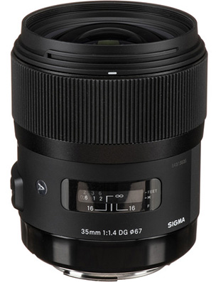
Big aperture = small f/number = small depth of field

Shallow depth-of-field. (Image courtesy of Pexels.com.)

Topic $TipTopic

This article, written by Brian Auer, first appeared in PictureCorrect.com. This is an excerpt.

Depth of field (DOF) is one of the most important factors in determining the look and feel of an image. You should know how to utilize this effect.

Depth of field refers to the distance (depth) from the focus point that a photo will be sharp, while the rest becomes blurry. A large, or wide, depth of field results in much of the photo in focus. A small, or narrow, depth of field results in much more of the photo out of focus.

There are four main factors that control depth of field: lens aperture, lens focal length, subject distance, and sensor size. Your sensor is pretty well set, so you won’t have much luck changing that. Your focal length and distance to the subject are usually determined by your choice of composition. So the lens aperture is your primary control over depth of field.

Before I get to the tips, let’s get a few things straight:

  • BIG APERTURE = SMALL F-NUMBER = SMALL DEPTH OF FIELD
  • SMALL APERTURE = BIG F-NUMBER = BIG DEPTH OF FIELD

Large apertures (small f-numbers) cause a narrow DOF, while small apertures (large f-numbers) cause a wide DOF.

If you want to bring an entire scene into focus and keep it sharp, use a small aperture. But be careful not to go too small. Lens sharpness starts to deteriorate at the smallest apertures.

The DOF extends behind and in front of the point of focus. It usually extends further behind than in front, though. So keep this in mind when choosing your focus point; you’ll want to focus about a third of the way into the scene rather than halfway.

Your focal length is usually determined by your choice of composition, but you should know how it affects your depth of field. Longer focal lengths (200mm) have less depth of field than shorter focal lengths (35mm).

EXTRA CREDIT

The link at the top has videos illustrating these concepts, as well as more information.


Please rate the helpfulness of this tip.

Click on a star to rate it!

… for Random Weirdness

Tip #729: 4 Top-Quality Prime Lenses Less than $1K

Larry Jordan – LarryJordan.com

Prime lenses are faster, crisper and less expensive than zooms.

Sigma 35mm f/1.4 DG HSM Art Lens (Image courtesy of Sigma.)

Topic $TipTopic

This article, written by Logan Baker, first appeared in PremiumBeat.com. This is an excerpt.

Capture beautiful images with these high-quality, low-cost prime lenses. Let’s look at some prime lenses that land in the high-quality/low-price sweet spot, all of them available right now for under $1,000.

  • Rokinon Cine 35mm T1.5 Cine DS Lens. Rokinon Cine series lenses might be the best deal in the industry right now. Each lens is fast, sharp, and priced to move, and pulling focus is about as smooth as it can be for glass this size.
  • Sigma 35mm f/1.4 DG HSM Art Lens. These lenses have skyrocketed in popularity over the past three years or so — and for good reason. First of all, they’re built like tanks and have a brag-worthy super-sharp 1.4 aperture. Plus, decent auto-focus capabilities make them a solid choice for filmmaking and photography.
  • SLR Magic MicroPrime CINE 25mm T1.5. If I was allowed only one word to describe this lens and, really, the entire line of SLR Magic lenses, that word would be underrated. For the price, the lenses are superb. Even if you take the price out of the equation, these lenses are superb.
  • Rokinon 14mm f2.8 ED AS IF UMC Series. This lens is the cheapest option on this list. Frankly, it’s also the simplest. And it’s 100% worthy of a spot in your filmmaking bag. It’s super wide and super sharp.

EXTRA CREDIT

In the link at the top are more details and videos illustrating each lens.


Please rate the helpfulness of this tip.

Click on a star to rate it!

… for Random Weirdness

Tip #716: 3-2-1 Backup Rule

Larry Jordan – LarryJordan.com

3 copies – 2 different media – 1 different location.

3 copies – 2 different media – 1 different location.

Topic $TipTopic

This article, written by Trevor Sherwin, first appeared in PetaPixel.com. This is an excerpt.

Whether you take your photos professionally or for fun, how many of you out there can truly say you’re are happy with your photo backup strategy? If a drive were to fail, will you lose any photos? If you have a house fire or were to be burgled, do you have a copy elsewhere?

Getting your backup processes in place is a bit boring and not very creative but the more seriously you take your photography, the more you need to have a robust workflow in place.

Put simply, the 3-2-1 backup strategy provides an easy-to-remember approach to how many copies of your data you should have and where those copies should be stored in order to protect against the most likely threats to your photos.

  • 3 (copies of your data)
  • 2 (different media or hard drives)
  • 1 (copy of your photos in another location)

The article, linked above, has more details, include a sample workflow on how to safely and efficiently backup your data.


Please rate the helpfulness of this tip.

Click on a star to rate it!

… for Apple Motion

Tip #719: Secrets of the Sequence Text Behavior

Larry Jordan – LarryJordan.com

Sequence Text animates font position, size, rotation, color, opacity and more.

Animated text.

Topic $TipTopic

This tip originally appeared as an Apple KnowledgeBase article. This is an excerpt.

You can build custom text sequence animations using the Sequence Text behavior (in the Text Animation category of behaviors in the Library). The Sequence Text behavior (not to be confused with the Text Sequence category of preset behaviors in the Library) lets you animate text attributes—scale, position, color, opacity, glow, and so on—in sequence, character by character. For example, you can create a sequence in which text characters fall vertically into place as they scale down, fade in, and rotate.

Because the Sequence Text behavior is not a preset, applying and activating it is a two-step process:

  • Step 1: Apply the Sequence Text behavior to a text layer in your project.
  • Step 2: In the Behaviors Inspector, assign the parameters you want to animate, then adjust controls to set the animation’s direction, speed, number of loops, and other qualities. (Optionally, you can assign the Position, Rotation, and Scale parameters by dragging onscreen controls in the canvas.)

EXTRA CREDIT

Using the Transform Glyph tool, you can modify individual text characters independently of the influence of the applied Sequence Text behavior.

Here’s a link to learn more: Modify Text glyphs.


Please rate the helpfulness of this tip.

Click on a star to rate it!

… for Apple Motion

Tip #718: Use Slip to Change Shot Content in Motion

Larry Jordan – LarryJordan.com

Slipping adjusts content without affecting duration.

Press the Option key, while dragging in the mini-timeline, to slip a clip.

Topic $TipTopic

This tip originally appeared as an Apple KnowledgeBase article. This is an excerpt.

Slipping adjusts a clip so that, while the duration remains the same, the in and out points shift to different positions in the clip.

NOTE: You can’t slip a clip if it hasn’t been trimmed first. You need handles at each end to slip a clip.

The mini-Timeline lies just above the canvas toolbar and below the canvas, providing an at-a-glance look at where selected objects fit into your overall project. To slip a clip:

  • In Motion, select the clip you want to modify so that it appears in the mini-Timeline.
  • Position the pointer over the body of the clip in the mini-Timeline, then press and hold the Option key. The pointer changes to a slip pointer.
  • Continue to press and hold the Option key, drag left or right in the mini-Timeline to use a later or earlier part of the clip.

A tooltip appears, indicating the new In and Out points.


Please rate the helpfulness of this tip.

Click on a star to rate it!

… for Apple Motion

Tip #717: Particle System Timing in Motion

Larry Jordan – LarryJordan.com

Particle systems can be any duration you need.

A particle system in the Apple Motion timeline, with elements offset.

Topic $TipTopic

This tip originally appeared as an Apple KnowledgeBase article. This is an excerpt.

When you create a particle system, its duration can be as long or short as necessary, regardless of the duration of the original source layers used to create the particle system. The duration of a particle system is defined by the duration of the emitter object. Changing the In or Out point of an emitter in the Properties Inspector, Timeline, or mini-Timeline changes the duration of the entire particle system.

By default, particles are generated by every cell in a system for the duration of the emitter. The duration of each generated particle is defined by the Life parameter of the cell that generated it, and not by the duration of the cell itself.

The duration of the cell governs the time span over which new particles are generated. You can change a cell’s duration by dragging its position or its In and Out points in the Timeline. In this way, you can adjust the timing that defines when each cell’s particles emerge.

For example, you can create a particle system that simulates an explosion by offsetting the appearance of different types of particles. First, dense white sparks emerge from the center. Half a second later, more diffuse orange blast particles appear around a larger area. One second after that, hot smoke emerges from underneath both of these layers, and smoky remains are left as the particles fade away.

You can offset a cell in the Timeline or mini-Timeline so that the cell starts before the emitter. This creates a “pre-roll” in which the particle simulation begins before the particles are drawn.


Please rate the helpfulness of this tip.

Click on a star to rate it!

… for Visual Effects

Tip #727: Enhance images – Gradients & Blend Modes

Larry Jordan – LarryJordan.com

Gradients plus blend modes make images much more interesting.

The same shot with different gradients applied using the Overlay blend mode.

Topic $TipTopic

We can use gradients applied using blend modes to enhance our shots; especially exteriors.

An easy way to enhance almost any exterior is to apply a gradient shading from black at the top to white at the bottom. This enhances the sky while lightening the foreground.

But, you don’t need to stop with a simple black-and-white gradient. The screen shot illustrates that colors can also enhance your shots.

  • The top image is the source.
  • The middle image has a blue-to-green gradient applied using Overlay.
  • The bottom image has a blue-to-orange gradient also applied using Overlay.

These gradients can be created in Photoshop, or the NLE of your choice. Experiment with your own colors and watch what happens. I’ve had the best results using Overlay.


Please rate the helpfulness of this tip.

Click on a star to rate it!

… for Visual Effects

Tip #723: 5 Highly Creative Edits

Larry Jordan – LarryJordan.com

Watch the video to see specific examples.

Topic $TipTopic

This article, written by Rubidium Wu, first appeared in PremiumBeat.com. This is an excerpt.

This video highlights some unusual and creative edits that can add value to your next video project.

Specifically:

  • The Punch Cut. By shooting a punch toward the camera, and then a reaction from the camera, you get a blow that appears to travel through the lens and into the audience.
  • Whip Pan Blur. As you pan, the image blurs. If you use this blur as a cut point between two shots, the effect is hidden in the pan. This can be great to hide a cut in a long take — or to make a stunt safer.
  • Shimmer Cut. By having ten or so interspaced single frames between your cuts, you can create a shimmer effect that has a lot of impact on the viewer. It’s best used for music videos when the beat kicks in.
  • Droop Cut. To enhance a regular “dip to black” fade between the cuts, I added a feathered vignette at the top and bottom of the frame. This looks more like the POV character is closing his eyes.
  • Dolly Behind Cut. If you ever have a scene where someone is interviewing multiple candidates, like a speed-dating environment or a police interrogation, it can be a nice transition to dolly behind the interviewer’s head, then cut at the moment the screen is black. This way you have an artful way of changing between characters in one shot.

The link at the top has videos that illustrate all these cuts.


Please rate the helpfulness of this tip.

Click on a star to rate it!

… for Codecs & Media

Tip #733: How Much Resolution is Too Much?

Larry Jordan – LarryJordan.com

The eye sees angles, not pixels.

At a normal viewing distance for a well-exposed and focused image HD, UHD and 8K look the same.

Topic $TipTopic

This article, written by Phil Platt in 2010 discussing how the human eye perceives image resolution, first appeared in Discovery.com. The entire article is worth reading. Here are the highlights.

As it happens, I know a thing or two about resolution, having spent a few years calibrating a camera on board Hubble, the space telescope.

The ability to see two sources very close together is called resolution. It’s measured as an angle, like in degrees. For example, the Hubble Space Telescope has a resolution of about 0.00003 degrees. That’s a tiny angle!

Since we measure resolution as an angle, we can translate that into a separation in, say, inches at certain distance. A 1-foot ruler at a distance of about 57 feet (19 yards) would appear to be 1 degree across (about twice the size of the full Moon). If your eyes had a resolution of 1 degree, then the ruler would just appear to you as a dot.

What is the resolution of a human eye, then? Well, it varies from person to person, of course. If you had perfect vision, your resolution would be about 0.6 arcminutes, where there are 60 arcmin to a degree (for comparison, the full Moon on the sky is about 1/2 a degree or 30 arcmin across).

To reuse the ruler example above, and using 0.6 arcmin for the eye’s resolution, the 1-foot ruler would have to be 5730 feet (1.1 miles) away to appear as a dot to your eye. Anything closer and you’d see it as elongated (what astronomers call “an extended object”), and farther away it’s a dot. In other words, more than that distance and it’s unresolved, closer than that and it’s resolved.

This is true for any object: if it’s more than 5730 times its own length away from you, it’s a dot. A quarter is about an inch across. If it were more than 5730 inches way, it would look like a dot to your eye.

But most of us don’t have perfect vision or perfect eyesight. A better number for a typical person is more like 1 arcmin resolution, not 0.6. In fact, Wikipedia lists 20/20 vision as being 1 arcmin, so there you go.

[Phil then summarizes:] The iPhone4 has a resolution of 326 ppi (pixels per inch). …The density of pixels in the iPhone 4 [when viewed at a distance of 12 inches] is safely higher than can be resolved by the normal eye, but lower than what can be resolved by someone with perfect vision.

LARRY’S EDITORIAL COMMENT

There’s a lot of discussion today about the value of 8K images. Current research shows that we need to sit within 7 feet (220 cm) of a 55″ HD image to see individual pixels. That converts to 1.8 feet to see individual the pixels in a UHD image. And 5 inches to see individual pixels in an 8K image on a 55 monitor.

Any distance farther and individual pixels can’t be distinguished.


Please rate the helpfulness of this tip.

Click on a star to rate it!

… for Codecs & Media

Tip #732: How Many Megapixels is the Eye?

Larry Jordan – LarryJordan.com

The eye is 576 megapixels – except, ah, it really isn’t.

The eye is more like a movable sensor than a camera.

Topic $TipTopic

This article first appeared in Discovery.com. This is an excerpt.

According to scientist and photographer Dr. Roger Clark, the resolution of the human eye is 576 megapixels. That’s huge when you compare it to the 12 megapixels of an iPhone 7’s camera. But what does this mean, really? Is the human eye really analogous to a camera?

A 576-megapixel resolution means that in order to create a screen with a picture so sharp and clear that you can’t distinguish the individual pixels, you would have to pack 576 million pixels into an area the size of your field of view. To get to his number, Dr. Clark assumed optimal visual acuity across the field of view; that is, it assumes that your eyes are moving around the scene before you. But in a single snapshot-length glance, the resolution drops to a fraction of that: around 5–15 megapixels.

Really, though, the megapixel resolution of your eyes is the wrong question. The eye isn’t a camera lens, taking snapshots to save in your memory bank. It’s more like a detective, collecting clues from your surrounding environment, then taking them back to the brain to put the pieces together and form a complete picture. There’s certainly a screen resolution at which our eyes can no longer distinguish pixels — and according to some, it already exists — but when it comes to our daily visual experience, talking in megapixels is way too simple.


Please rate the helpfulness of this tip.

Click on a star to rate it!