… for Random Weirdness

Tip #1560: Female Filmmakers: Sony Has $$ For You

Larry Jordan – LarryJordan.com

Contest open to female filmmakers or photographers over age 18.

Sony’s Alpha Female logo.

Topic $TipTopic

This article, written by Oakley Anderson-Moore, first appeared in NoFilmSchool.com. This is a summary.

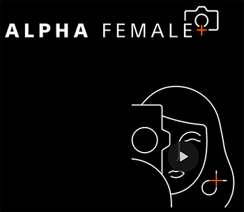
In 2018, Sony launched the Alpha Female line. Now in 2021, they’ve added a “+” to the newest iteration of their lady-creatives residency, which comes with more grants for more filmmakers.

Who is this for? Female filmmakers and photographers over 18 who live in the United States or Canada. How do you get the cash and gear? You send in some details about who you are and a description of your next video project. If you are one of the 12 filmmakers selected, you’ll get $8,000 in cash and gear!

Sony’s Michaela Ion explains: “If you’re new to Alpha Female, here is the view from above: Our lives are richer when we can see the world through different perspectives. In the photography and video industry there’s a substantial disparity in gender and minority representation, which means some perspectives don’t see the light of day and we’re the poorer for it. Alpha Female was created to help close the gap and make our industry an environment where all voices have an opportunity to thrive.”

For details, links and contest video, vist here.


Please rate the helpfulness of this tip.

Click on a star to rate it!

… for Random Weirdness

Tip #1562: Instagram Reel Editing Tips

Larry Jordan – LarryJordan.com

Sometimes, you gotta work with the tools you’re given.

The Instagram logo.

Topic $TipTopic

This article first appeared in Shutterstock.com. This is a summary.

In 2020, Instagram Reels was launched. While successful, the popularity of Instagram Reels didn’t take off until Instagram adjusted the layout so the Reels feed appeared as the central button of the app. Now, nearly every sports team, celebrity, and influencer is using Reels to grow their brand. Let’s look at six editing tips so you can get the best out of the Instagram app, as well.

Here are six tips to improve your video editing on Instagram. (The article has sample videos that illustrate each technique.)

  1. Learn how to edit using Instagram. The article contains a quick, three-minute tutorial that will give you a step-by-step guide on using the application.
  2. Cut Action on Transitions. Cutting on action is one of the core fundamentals of film editing to create a sense of fluid and continuous movement. Cutting on action is also the perfect technique for when you’re creating transitions of yourself. However, it does require pre-emptive planning.
  3. Smooth Wipe. A method that allows filmmakers to trick the audience into thinking that a long, complex shot was captured in one take, as they pass the camera in front of something, stop recording, then start again from behind the object. The editor will then cut the two shots together when both the first shot and second shot are behind the thing.
  4. Align Tool. Instagram has a built-in tool for you to do this easily—the Align tool. Simply open the app and create your first recording. Change outfits, remove the object, and then select the Align tool. You’ll now see an overlay of the prior video clip, allowing you to align yourself in the overlay position correctly.
  5. Cut to the Beat. Cutting to the beat is a tried and tested formula for music video editing to create a rhythmic form of visuals. While you don’t have to cut to every single beat, when you’re switching scenes, cutting on a beat is aesthetically pleasing.
  6. If You Can’t Beat Them, Join Them. If you find yourself endlessly scrolling through the presented Reels that Instagram algorithmically shows you, you’ll notice a recurring theme with both editing techniques and music used. While it won’t promote originality, the familiar conventions of following popular trends are a good way to engage non-followers.

Please rate the helpfulness of this tip.

Click on a star to rate it!

… for Apple Motion

Tip #1553: Creating Imperfections: Droplets

Larry Jordan – LarryJordan.com

While this effect can be stationary, it will look better animated.

Droplet settings with keyframe (top) and animated results (bottom).

Topic $TipTopic

Sometimes, you don’t want things to look perfect. You’d rather they look a bit more “real.” Here, I opened an animated logo for my company that we created a few years ago. This week, I was playing with it to see what more I could do and discovered this trick.

Select something animated. While you can use any image, line drawings or other graphic images may work best.

Apply Filters > Distortion > Droplet.

Since we can’t apply Behaviors to filters, we need to use keyframes to change the location of the droplet.

In this example, I keyframed the Center settings (top screen shot) to have the droplet pass through the frame right-to-left as the star was flying from left-to-right.

Overall, Droplet adds an interesting – and eye-catching – shifting shape to the comet tail and the text that comes on screen shortly.


Please rate the helpfulness of this tip.

Click on a star to rate it!

… for Apple Motion

Tip #1554: Just Playin’ Around

Larry Jordan – LarryJordan.com

Don’t forget to adjust opacity or blend modes to help blend elements.

The “Flying Space Rock (and shadow)” along with the the Layers pane.

Topic $TipTopic

Here’s an interesting technique that creates synced movement using a copied motion path… and a flying space rock.

What, I wondered, would a flying space rock look like? Clearly, it needs to move and, because I could, I added a floating green cloud behind it – tracking it’s movements.

THE ROCK

The Rock is a 3D shape in the Motion Library (3D Objects).

  • Add it to the Viewer
  • Apply Basic Motion > Motion Track
  • Option-click the red motion track line to add a keyframe to the track and create a curve.
  • Change Inspector > Properties > Opacity to 80% to blend the Rock with the Cloud.

THE CLOUD

Blurry Cloud is in the Motion Library (Content > Particle Images).

  • Add it to the Viewer
  • Change Inspector > Properties > Opacity to 50% to soften and add translucency.
  • Change Properties > Scale to 300-400%; make it lots bigger.
  • Apply Filters > Color > Colorize and pick a color you like
  • Apply Behaviors > Basic Motion > Spin
  • Apply Filters > Blur > Gaussian Blur and make this much blurrier.
  • Option-drag the Motion Track from the Rock to the Blurry Cloud. This copies the effect from one element to the other.

TWEAK

Play this, then tweak things as much as you want. Consider adding Parameter behaviors to add jitter or oscillation to the movement.


Please rate the helpfulness of this tip.

Click on a star to rate it!

… for Apple Motion

Tip #1555: Spins Can Also Be 3D

Larry Jordan – LarryJordan.com

Video is always 2D, but particles and 3D objects are 3D.

The tumbling Space Rock, and the Spin > Axis setting that makes it possible.

Topic $TipTopic

When we work with video in Motion, it is easy to overlook that the Spin behavior actually works in 3D. But it does.

In Tip #1554, I created the “Flying Space Rock.” But, the Rock itself needs to spin. Since this is a 3D object, it makes sense to show its 3D nature.

So, I added Behaviors > Basic Motion > Spin.

Then, while I could adjust this using the HUD, instead I used Inspector > Behaviors > Spin and changed the rotation Axis to X.

This made the rock tumble in a way we would not normally expect.

EXTRA CREDIT

You can achieve the same results by dragging the inner blue circle for the Spin behavior in the HUD.


Please rate the helpfulness of this tip.

Click on a star to rate it!

… for Visual Effects

Tip #1563: Inspiration Resource

Larry Jordan – LarryJordan.com

Inspiration comes in small packages – that pack a punch.

(Image courtesy of Motionographer.com)

Topic $TipTopic

Looking for a resource for inspiration? Check out the “Quickies” page at Motionographer.

This website is dedicated to “unexpected inspiration” for visual effects artists, as well as news, festivals, awards ad blogs.

But the real fun is in watching the short – 1 – 2 minute – animations and motion graphics on the site.

Here’s the link.


Please rate the helpfulness of this tip.

Click on a star to rate it!

… for Visual Effects

Tip #1565: 10 Mo-Graph Artists to Follow on Twitter

Larry Jordan – LarryJordan.com

Ten creative artists with a strong Twitter presence.

An artistically rendered Twitter logo.

Topic $TipTopic

This article first appeared in MotionArray.com. This is a summary.

If you are a motion graphic designer or just interested in the art form, here are 10 mo-graph artists that you should definitely be following on Twitter.

NOTE: The article linked above has videos from each artist, along with a longer description.

  • GMUNK: @gmunk
  • Andrew Kramer: @videocopilot
  • Fraser Davidson: @FrazDav
  • Jorge Canedo Estrada: @jrcanest
  • Danny Yount: @dannyyount
  • EJ Hassenfratz: @eyedesyn
  • Ash Thorp: @Ashthorp
  • Markus Magnusson: @motionmarkus
  • Dave Chenell: @davechenell
  • Oliver Sin: @oliversin

Please rate the helpfulness of this tip.

Click on a star to rate it!

… for Adobe Premiere Pro CC

Tip #1556: Use Curves to Create Custom Gradients

Larry Jordan – LarryJordan.com

This technique would also work with gradients of other colors or shapes.

Custom curve settings (bottom) and the color results it created in a gradient (top).

Topic $TipTopic

I was messing with curves to create a screen shot for an ad promoting my new Color Techniques for Adobe Premiere Pro training bundle. What I discovered, totally by accident, is that this is also a great way to create custom gradients.

To start, I added a white-to-black gradient to the timeline. I created this in Photoshop; though you could also create it in Premiere.

Then, with the gradient clip selected in the timeline:

  • Switch to the Color workspace
  • Click the Curves text button
  • Select the color curve you want to adjust (Luma, Red, Green or Blue).
  • Option-click to create a keyframe in a curve, then drag the keyframe to a new location. As you do, you’ll see the color results reflected in the gradient.

EXTRA CREDIT

There’s no “right” way to adjust curves. Play with these and see what you can create.


Please rate the helpfulness of this tip.

Click on a star to rate it!

… for Codecs & Media

Tip #1564: Premiere Pro’s Color Management

Larry Jordan – LarryJordan.com

Colors shift, especially with different playback platforms.

Image courtesy of Oliver Peters.

Topic $TipTopic

This article, written by Oliver Peters, first appeared in ProVideoCoalition.com. This is a summary.

Read through any of the online forums and you’ll often see this common concern: “Why doesn’t my export look the same in QuickTime as it does in Premiere Pro?” This tends to be more common with Mac users than PC users, but it happens with Windows, too. The underlying assumption that they should match is a fallacy and Oliver explains why in this article.

Let’s start with displays. If you line up a CRT monitor, an older flat-panel plasma, and newer LCD, LED, and OLED displays, then you would be very hard-pressed to get the same image to match identically across all displays, even with calibration.

The world of Apple displays.If you are working on a newer Apple iMac, iMac Pro, or Pro Display XDR, then you are using an image system calibrated for a different display profile. iMacs use the P3 D-65 color standard with the ability to go up to 500 nits of brightness. The only consistent reference you will ever have is how the image appears through AJA or Blackmagic i/o hardware to a reference display.

Adobe Premiere Pro’s working color space. SDR sequences in Premiere Pro are designed to use Rec 709, 2.4 gamma as the working color space for the timeline and viewer. There’s a preference toggle for display color management to compensate for the interface display that you are using.

Solving the problem? My recommendation is to turn display color management ON in the Premiere Pro preferences. This gives you a proper visual match between the timeline and the output to a reference display. Unfortunately this leaves you with the dilemma of the exported file. The simplest answer is to first export a “standard” file for broadcast use. Then add an adjustment layer to your Premiere Pro sequence and apply a Lumetri effect to it. Increase saturation and lower shadows slightly. Test to taste.

But, if we are posting to the web, social platforms make additional changes to our color that are beyond our control.


Please rate the helpfulness of this tip.

Click on a star to rate it!

… for Codecs & Media

Tip #1567: A New Way to Create Color “Looks”

Larry Jordan – LarryJordan.com

Two new products enable colorists to improve their look.

(Image courtesy of color.io.)

Topic $TipTopic

Color.io just launched Photon 3D Color Grading and Match, both designed to enable colorists to create the visual looks they need.

Match is a free image color matching app that can copy colors of any image with one click. Use machine learning to create your own color grading presets and instantly change the color of your images with one powerful, simple-to-use web app that runs directly in your browser on match.color.io.

Photon is a new, revolutionary way of working with color. It’s easy to use and has powerful features that make it possible for anyone to create professional color grades. Whether you’re an artist, photographer or cinematographer, Photon will help you get the most out of your work.

Available as standalone software for macOS and Windows with optional OFX connector plugin for Resolve.

Here’s the link.

EXTRA CREDIT

This is a not a subscription application. Buy once and it will work without limitations for as long as you need it.


Please rate the helpfulness of this tip.

Click on a star to rate it!