The difference is in what rotates – the camera or the subject.
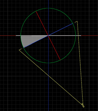
Panning with a framing camera; the subject is the white line.
There are two ways to pivot a camera: around the tripod or around the subject. Here’s a quick tip to explain the difference.
We are all familiar with pivoting a camera on a tripod. The camera stays in the same place, while the field of view rapidly shifts. This is ideal for subjects who are moving from one place to another.
In other words, the camera position holds still while the subject moves.
But, what if you are shooting an object on a table? If you pivot the camera on a tripod, you lose the view of the table and need to reposition the table.
A “framing camera” fixes this problem. First invented for shooting animation stills, a framing camera pivots the camera around the subject.
In other words, the subject position holds still while the camera moves around it.
Please rate the helpfulness of this tip.
Click on a star to rate it!
https://www.theinsidetips.com/wp-content/uploads/2019/09/Tips-Logo-700x150.jpg00Larry Jordanhttps://www.theinsidetips.com/wp-content/uploads/2019/09/Tips-Logo-700x150.jpgLarry Jordan2020-03-11 01:30:002020-04-05 20:19:35Tip #504: Comparing a Framing vs. Tripod Camera
The underlying point of these is to be sure you can work with your shots later in post.
The CGGeek posted a YouTube video presenting “10 Tips for Filming Visual Effects.” While I don’t agree with all of them, especially because his entire video was shot out of focus, I do agree with most of them.
They are:
Take your camera off the tripod and shoot with camera motion. (This, I think, needs to be taken with a grain of salt, depending upon how much tracking and rotoscoping will be needed.)
Shoot at a high shutter speed for fast moving VFX shots, above 1/500th of a second.
Write down the camera settings: focal length, shutter and frame rate.
Use lots of high-contrast camera markers to simplify motion tracking later.
Lock your camera on a tripod, then add motion later in post.
Avoid pans, zooms and fast camera motion when doing camera tracking.
Always shoot a flat, background plate in case you need to garbage mask your actors.
Take a 360° environmental photo to show the overall scene.
Use the sky as a blue-screen background.
Track both foreground and background, the extra depth improves the results of a camera track.
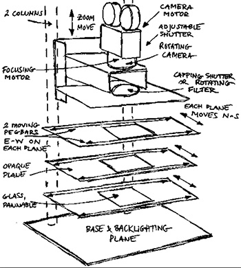
Multiple planes allows changes in depth, focus and perspective.
Sketch of a 4-plane multiplane camera showing the glass plates and different motions.
When photographing traditional cell animation, all elements are painted onto a single cell. The problem is that you can’t create a sense of depth through movement. The multiplane camera fixes this.
First used by Lotte Reiniger for her animated feature The Adventures of Prince Achmed in 1926, the concept was further developed by Ub Iwerks for the Walt Disney Studios in 1933.
The multiplane camera is a motion-picture camera used in the traditional animation process that moves a number of pieces of artwork past the camera at various speeds and at various distances from one another. This creates a sense of parallax or depth.
Various parts of the artwork layers are left transparent to allow other layers to be seen behind them. The movements are calculated and photographed frame by frame, with the result being an illusion of depth by having several layers of artwork moving at different speeds: the further away from the camera, the slower the speed. The multiplane effect is sometimes referred to as a parallax process.
An interesting variation is to have the background and foreground move in opposite directions. This creates an effect of rotation. An early example is the scene in Walt Disney’s Snow White and the Seven Dwarfs where the Evil Queen drinks her potion, and the surroundings appear to spin around her.
The most famous multiplane camera was invented by William Garity for the Walt Disney Studios for the production of Snow White and the Seven Dwarfs. The camera was completed in early 1937. Disney’s multiplane camera, which used up to seven layers of artwork (painted in oils on glass) shot under a vertical and moveable camera, allowed for more sophisticated uses than the Iwerks version and was used prominently in Disney films such as Pinocchio, Fantasia, Bambi, The Adventures of Ichabod and Mr. Toad, Cinderella, Alice in Wonderland, Peter Pan, Sleeping Beauty and The Jungle Book.
Here’s a link to a video of Walt Disney in 1967 illustrating how a multiplane camera works.
Please rate the helpfulness of this tip.
Click on a star to rate it!
https://www.theinsidetips.com/wp-content/uploads/2019/09/Tips-Logo-700x150.jpg00Larry Jordanhttps://www.theinsidetips.com/wp-content/uploads/2019/09/Tips-Logo-700x150.jpgLarry Jordan2020-03-11 01:30:002020-04-05 20:21:21Tip #512: Animate With a Multi-Plane Camera
The only requirement for a chroma-key is that the background color not be used in the foreground.
In this illustration, the color red is translucent, because we are using it as the key color.
Green-screen is shorthand for a “chroma-key,” that is a key based upon a color. We remove a background by making all the pixels of a certain color transparent so we can put something else in its place. However, a “green-screen key” doesn’t, in fact, require anything green. It’s just that, when people are involved, we use green more than any other color. In the past, video used blue backgrounds, while film used green, simply due to how video and film responded to the two different colors.
Over time, we standardized on green because it is a color that is not in human skin tone and, while many of us like wearing varying shades of blue, green is much more rare in clothing.
NOTE: However, if you are creating a key to recreate a night scene, you are better off using a blue background, because moonlight is very blue and the edges of the key will fit in better with the night look.
What a chroma key does is look at the color of each pixel. If it finds one that matches the color you want to remove, it makes that pixel transparent. The key color could be green for people, red for lizards or blue for, say, an agricultural spot set in a cornfield.
There’s no magic that determines which color you use – any modern keyer can key on any color. Pick the one that works the best for your project. (Like the red backgrounds I saw used for “The Lizard King from Outer Space.” Very, very weird.)
Please rate the helpfulness of this tip.
Click on a star to rate it!
https://www.theinsidetips.com/wp-content/uploads/2019/09/Tips-Logo-700x150.jpg00Larry Jordanhttps://www.theinsidetips.com/wp-content/uploads/2019/09/Tips-Logo-700x150.jpgLarry Jordan2020-03-04 01:30:002020-03-04 01:30:00Tip #500: When is a Green-Screen Key Red?
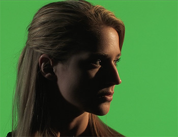
Light the background for evenness. Light the foreground for drama.
Here, Lisa is lit for drama, while the background is lit evenly.
One of the challenges that new cinematographers face in lighting green-screen shots is that there is almost no correlation between the lighting of the background versus the foreground. In fact, they should be lit separately. Here’s why.
Lisa, in this screen shot, is an excellent example.
The background is a highly-saturated green because the key needs color, not just brightness, to work. As well, the background is very evenly lit and, if you looked at it on the Waveform Monitor, it would be right at 50% grayscale. (This is because 50% gray is the optimum value for maximizing color saturation.)
But, Lisa, herself, is very dark. This is because it is a very dramatic scene and it needs to be dark. It could, in fact, be a silhouette. There is NO correlation between how you light the foreground from the background.
One other important point to keep in mind: To minimize spill from the green background hitting the shoulders and hair of the foreground talent, try to keep talent ten feet or more in front of the green background. (In this screen shot, Lisa was 12 feet in front of the background.)
Please rate the helpfulness of this tip.
Click on a star to rate it!
https://www.theinsidetips.com/wp-content/uploads/2019/09/Tips-Logo-700x150.jpg00Larry Jordanhttps://www.theinsidetips.com/wp-content/uploads/2019/09/Tips-Logo-700x150.jpgLarry Jordan2020-03-04 01:30:002020-03-04 01:30:00Tip #501: Lighting for Green-Screen
Texture comes from gray-scale. We can change hue, but not brightness.
This is Brittney. She’s one of the models from the now-defunct GlamourKey.com website. She’s wearing a deep blue shirt. Except, the script called for her to wear burgundy. Or maybe light pink, it was a toss-up…
The problem is that when we are changing the color of something in post, we can change it’s hue or saturation, but we can’t change it’s gray-scale. Why? Because variations in gray-scale provide objects their texture. If I replace both color and gray-scale her shirt, which has nice folds in the sleeves, suddenly become a block of solid, undistinguished color.
NOTE: To prove the point about texture, the background behind Brittney on the left has a single gray-scale value: 50%. The background behind her on the right, has gray-scale values that range from 0 to 100.
So, in Brittney’s case, I can replace dark blue with dark green, or dark red, but not light pink, because I can’t change the gray-scale values enough in her shirt to create light pink from burgundy.
Please rate the helpfulness of this tip.
Click on a star to rate it!
https://www.theinsidetips.com/wp-content/uploads/2019/09/Tips-Logo-700x150.jpg00Larry Jordanhttps://www.theinsidetips.com/wp-content/uploads/2019/09/Tips-Logo-700x150.jpgLarry Jordan2020-03-04 01:30:002020-03-04 01:30:00Tip #502: The Challenges of Changing a Color
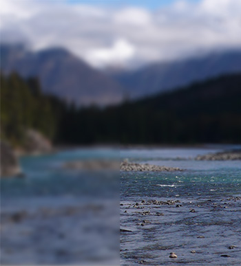
A Tilt-Shift Blur blurs an image in stages, simulating depth of field.
Gaussian blur on the left, Tilt-Shift blur on the right. The difference is at the bottom.
A tilt-shift blur simulates depth of field or the softening of edges with distance from a light source. Here’s what it looks like.
In this screen shot, the left side is a normal Gaussian blur. On the right, is a tilt-shift blur.
Notice in the image on the left, the entire image is blurred by the same amount. While, in the image on the right, the foreground is in focus, the mid-ground is softly out of focus and the background is deeply out of focust.
This effect more accurately simulates how a camera lens might interpret an image.
NOTE: Final Cut supports this effect using Blur > Focus. Premiere does not currently support this effect. The screen shot was created in Photoshop.
Please rate the helpfulness of this tip.
Click on a star to rate it!
https://www.theinsidetips.com/wp-content/uploads/2019/09/Tips-Logo-700x150.jpg00Larry Jordanhttps://www.theinsidetips.com/wp-content/uploads/2019/09/Tips-Logo-700x150.jpgLarry Jordan2020-02-26 01:30:002020-02-26 01:30:00Tip #487: What’s a Tilt/Shift Blur
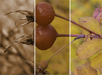
Tinting looks better when you first convert a clip to black-and-white.
Left is a correctly tinted clip, middle is with the sepia filter alone, right is the original clip.
All editing software has an effect that tints a clip, such as sepia. But, when you apply it, it looks awful. Why? Here’s what you need to know.
This screen shot illustrates the problem. The right side is the original image, the center has a sepia effect applied; which looks pretty awful.
The reason is that when you apply a tint filter, the software simply applies the color effect to the existing clip. If you have a highly saturated clip, such as these berries, the color in the clip overwhelms the tinting filter.
The solution is to first remove the saturation from a clip which converts it to black-and-white, then apply the tint filter. (The processing order of your effects is important here.)
Once the original color is removed, there’s nothing for the tint to fight against and the tinted clip looks the way you expect; which is what you see on the left side of this image.
Please rate the helpfulness of this tip.
Click on a star to rate it!
https://www.theinsidetips.com/wp-content/uploads/2019/09/Tips-Logo-700x150.jpg00Larry Jordanhttps://www.theinsidetips.com/wp-content/uploads/2019/09/Tips-Logo-700x150.jpgLarry Jordan2020-02-26 01:30:002020-02-26 01:30:00Tip #488: Tips to Improve Color Tints
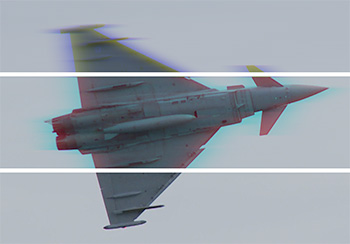
As long as you blur only one channel, your image will stay mostly in-focus.
A 2-channel blur (top), a 1-channel blur (middle) and the source image.
The channel blur effect blurs one, two or all three color channels in a clip. (Red, green and blue are the three color channels in any clip.) By selectively blurring a single channel you can, for example, imply speed or create a halo, without sacrificing apparent focus.
Here’s a detail from an air show clip. The bottom section is the source. The middle blurs just the blue channel. The jet develops a “halo,” which, to me, makes it seem like it is flying really fast.
Only when we blur two channels do we lose focus and, now, the jet looks like it’s part of a bad dream (top).
Play with this and see what you think. If you blur the dominant color, you won’t lose much focus.
The more you think about your shots before you start production, the better your production will be.
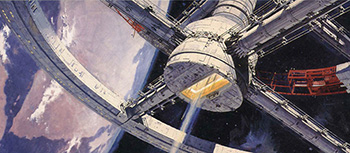
Original concept art for “2001: A Space Odyssey;” courtesy of Dr. Robert McCall.
This article first appeared in RocketStock.com. This is an excerpt.
Pre-visualization is critical for any visual project. The script is your foundation, while the art for pre-production is the frame that rests upon that foundation. Previsualization, or Previs, is a process of visualizing the scenes of a film before production even begins.
Concept art enables the producer and director to think about the look of a scene, as well as use it early in pre-production as an asset for the pitch, which is the process of selling your idea to a production company.
Concept art is the overall look and feel. Storyboards provide a shot-by-shot breakdown. The great thing about storyboards is that you don’t have to be a master artist to create them. In fact, all you really need is enough visual information that makes sense to you as a director. There is a great interview from AFI with Steven Spielberg where he talks about the importance of storyboarding. He also discusses how he begins the process by using stick figures and cues and then gives this rough draft to his sketch artist, George Jensen, who fleshes out the final storyboards.
When developing concept art and storyboards, you aren’t just developing them for the director and production crew. You’re also developing them for the VFX team that will work to make things happen in post. In order to make sure you film everything correctly during production, sometimes you have to take those concepts or storyboards and run tests to see if it will all work.
The article in RocketStock is filled with examples and film excerpts. It is worth reading.
Please rate the helpfulness of this tip.
Click on a star to rate it!
https://www.theinsidetips.com/wp-content/uploads/2019/09/Tips-Logo-700x150.jpg00Larry Jordanhttps://www.theinsidetips.com/wp-content/uploads/2019/09/Tips-Logo-700x150.jpgLarry Jordan2020-02-19 01:30:002020-02-19 01:30:00Tip #459: Improve Your Visuals with Pre-Viz
We may request cookies to be set on your device. We use cookies to let us know when you visit our websites, how you interact with us, to enrich your user experience, and to customize your relationship with our website.
Click on the different category headings to find out more. You can also change some of your preferences. Note that blocking some types of cookies may impact your experience on our websites and the services we are able to offer.
Essential Website Cookies
These cookies are strictly necessary to provide you with services available through our website and to use some of its features.
Because these cookies are strictly necessary to deliver the website, refuseing them will have impact how our site functions. You always can block or delete cookies by changing your browser settings and force blocking all cookies on this website. But this will always prompt you to accept/refuse cookies when revisiting our site.
We fully respect if you want to refuse cookies but to avoid asking you again and again kindly allow us to store a cookie for that. You are free to opt out any time or opt in for other cookies to get a better experience. If you refuse cookies we will remove all set cookies in our domain.
We provide you with a list of stored cookies on your computer in our domain so you can check what we stored. Due to security reasons we are not able to show or modify cookies from other domains. You can check these in your browser security settings.
Google Analytics Cookies
These cookies collect information that is used either in aggregate form to help us understand how our website is being used or how effective our marketing campaigns are, or to help us customize our website and application for you in order to enhance your experience.
If you do not want that we track your visit to our site you can disable tracking in your browser here:
Other external services
We also use different external services like Google Webfonts, Google Maps, and external Video providers. Since these providers may collect personal data like your IP address we allow you to block them here. Please be aware that this might heavily reduce the functionality and appearance of our site. Changes will take effect once you reload the page.
Google Webfont Settings:
Google Map Settings:
Google reCaptcha Settings:
Vimeo and Youtube video embeds:
Other cookies
The following cookies are also needed - You can choose if you want to allow them:
Privacy Policy
You can read about our cookies and privacy settings in detail on our Privacy Policy Page.