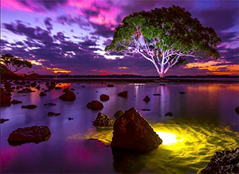
As cameras get faster lights can get smaller. Take a look at the results!
Image courtesy LumaCube & ShipWreck Photography
I’ve always been fascinated by beautiful lighting – from portraits to wide shots. Most of the time, the stuff I like takes a generator, a crew of 50 and three semi’s worth of gear. Which, these days, is out of the question. Sigh…
Recently, though, I’ve been amazed with the light output and creativity coming from small LumaCubes. These seem perfect for lighting small indoor home studios – especially for live streaming and close cameras.
However, that doesn’t mean they can’t be used outside. If you are looking for stunning photography created using microscopically small lights, take a look at the Gallery page of the LumaCube website.
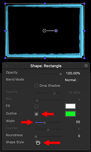
Shape styles can be applied to any shape, and are control by Outline > Width.
A rectangle with a blue Traditional > Acrylic shape style applied.
You are probably familiar with using Fill and Outline for shapes. But there is a wealth of other edge options hiding in Shape Styles. After you draw a shape, or use the pen or paint brush tools to create a shape, select the shape using the Arrow tool.
NOTE: If you select a shape using the Shape tool, changes will affect the NEXT shape you draw, not the current one.
With the shape selected, check Outline, then enter a Width value of 10 or more.
Open the HUD (F7) and click Shape Style at the bottom. There you’ll find dozens of different styles from Traditional to Light, that can be applied to the edges of your shape.
Use Width to modify the width of the effect.
EXTRA CREDIT
Shape styles can only be applied to the edges of a shape drawn by the shape, pen or paint brush tools.
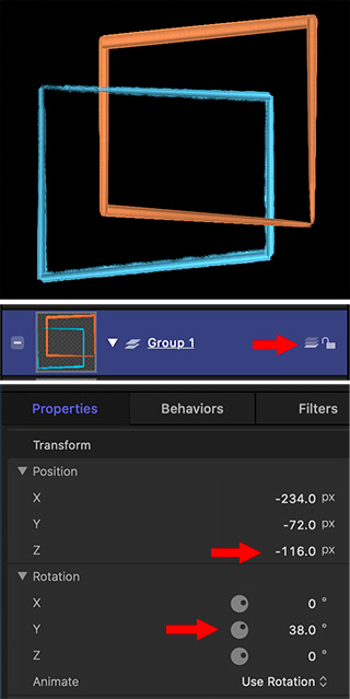
Top red arrow: Switch from 2D to 3D. Middle arrow: Move an element back in space. Bottom arrow: Adjust rotation of element.
Motion provides a very easy way to create 3D effects, where one element passes through another. Best of all, it just takes one mouse click.
After creating the shapes you want:
Store them in the same folder. (This isn’t strictly necessary, but it makes things easier.)
On the right side of the group holding the shapes, click the 3 Shapes icon, indicated by the top red arrow. This switches the group from 2D to 3D.
Select an element, then go to Inspector > Properties and twirl down Rotation. Adjust the Y axis so the shape goes back from the front of the screen.
Twirl down Position and adjust Z position until one shape passes through the next.
Tweak Position and Rotation settings for all elements to get the look of the depth you want.
Please rate the helpfulness of this tip.
Click on a star to rate it!
https://www.theinsidetips.com/wp-content/uploads/2019/09/Tips-Logo-700x150.jpg00Larry Jordanhttps://www.theinsidetips.com/wp-content/uploads/2019/09/Tips-Logo-700x150.jpgLarry Jordan2020-04-09 01:30:002020-04-04 10:51:25Tip #596: An Easy Way to Create a 3D Look
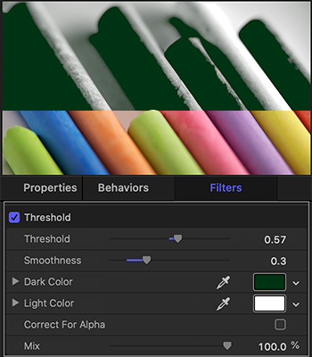
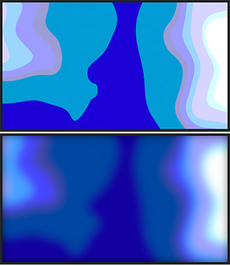
Threshold creates striking duo-tone images, which you can then colorize.
Threshold creates duo-tone images (top) from a full color image (middle) using the settings illustrated at the bottom.
If you want to create striking, duo-tone backgrounds, the Threshold filter in Apple Motion is exactly what you need.
The Threshold filter converts full-color images into stark, black-and-white images which you can then colorize using the same filter. The operation is simple:
Select an image. Then, apply Filters > Color > Threshold.
Instantly the image is a black-and-white duotone.
Next, select one of the two color boxes and adjust colors to suit. For me, the most effective color to adjust is the darker box.
The screen shot shows the results (top), source (middle), and the settings that got us there (bottom).
Feathering softens edges in images, shapes or masks.
The feathered edge of a mask. The top half shows feathering out, while the lower half illustrates feathering in.
Feathering softens edges. When you soften (feather) an edge, the softening has to go somewhere. This means that you can feather OUT from the edge (top of screen shot) or IN from the edge.
Think of feathering as “blurring the edges.” It affects the edge, but not the rest of the image. Feathering has three components:
The direction of the feather
The amount of the feather
The shape of the ramp from the edge to the surface
Each NLE has options which allow you to adjust each of these parameters.
However, feathering will not allow you to extend an image beyond its original borders.
Please rate the helpfulness of this tip.
Click on a star to rate it!
https://www.theinsidetips.com/wp-content/uploads/2019/09/Tips-Logo-700x150.jpg00Larry Jordanhttps://www.theinsidetips.com/wp-content/uploads/2019/09/Tips-Logo-700x150.jpgLarry Jordan2020-04-08 01:30:002020-04-04 10:41:07Tip #594: What Is Feathering?
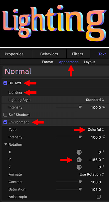
Colorful lighting is one menu choice away, and you can customize it to suit.
A sample lighting effect and the settings that created the colors.
There’s a hidden lighting secret in Motion for 3D text that is worth learning: colored light! At the top of the screen shot is an example of lighting 3D text with colored light. Here’s how to create it:
Create any 3D text.
Select the text in the Layers panel.
Go to Inspector > Text > Appearance, then twirl down Lighting and enable Environments.
Show the contents of Environments by clicking the word Show to the right of the word “Environments.”
Change Type from Field to Colorful.
Change the Rotation to pick out the colors you like.
For more control, twirl down Rotation and modify each of the axes. The effect changes with each. I’ve found that changing X rotation creates some very dramatic underlighting.
When you get the look you want, ah, stop tweaking. The screen shot shows the settings I used to create the lighting effect at the top.
Done.
Please rate the helpfulness of this tip.
Click on a star to rate it!
https://www.theinsidetips.com/wp-content/uploads/2019/09/Tips-Logo-700x150.jpg00Larry Jordanhttps://www.theinsidetips.com/wp-content/uploads/2019/09/Tips-Logo-700x150.jpgLarry Jordan2020-04-02 01:30:002020-04-02 01:30:00Tip #581: Create Colorful Lighting for 3D Text
Backgrounds, to be useful, need to be slow, dark and soft.
The Goo background before (top) and after (bottom) after effects are applied.
The problem I have with most of Apple’s default backgrounds is that they are too BRIGHT and too in-focus for text. Well, yeah, they are too busy, too.
Fortunately, this is easy to fix. Here are some ideas to try when you need to bring a background back under control. I’m going to work with Library > Content > Backgrounds > Goo, but you can pick anything.
It’s moving too fast. Select the Clouds layer inside Goo, then go to Inspector > Generator and change Speed to 0.07.
All the edges are waaay too sharp. This is because this effect is simply the Cloud generator with a Posterize filter applied. Select the Goo layer, apply Filters > Blur > Gaussian Blur and, in the Inspector, manually type in an Amount of 150.
NOTE: If you try to use the slider, it will stop at 64. Manually typing in numbers allows you to enter much larger values for almost every parameter.
It’s also too bright, so, with the Goo layer selected, apply Filter > Color > Levels and make sure it is placed below Gaussian Blur in the Layers panel. Adjust the mid-tone slider so that the background gets as dark as you need. If there’s a lot of light shades, pull down the highlights a bit, too.
NOTE: You could do something similar by adjusting Opacity, but that actually makes the background transparent. Levels makes it darker without adding transparency.
As with all effects, adjust the settings until you are happy. In the screen shot, the top image is “before,” the bottom image is “after.”
Please rate the helpfulness of this tip.
Click on a star to rate it!
https://www.theinsidetips.com/wp-content/uploads/2019/09/Tips-Logo-700x150.jpg00Larry Jordanhttps://www.theinsidetips.com/wp-content/uploads/2019/09/Tips-Logo-700x150.jpgLarry Jordan2020-04-02 01:30:002020-04-02 01:30:00Tip #582: Make a Better Background
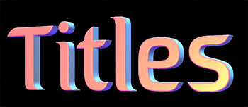
“Less is More” and pay attention to brand guidelines.
A good title doesn’t have to be complex to be compelling.
This tip, written by Kevin Luiz, first appeared in RedSharkNews.com. This is a summary.
You don’t have to be a master motion graphics guru in order to create effective, and importantly, thematically relevant looking titles for your videos. Here’s how to approach graphical title design even if animation and typography isn’t your primary skillset.
When devising how you’d like to integrate type font, lower thirds and other graphic elements such as logo animations or plates, make sure to request the company’s brand guidelines. This may seem like a “duh” to most, but I can’t tell you how many editors I’ve come across who purposely ignore these sheets to impose their own stylistic agendas. As a general guideline, I’ll spend about an hour sifting through a client’s outlets to get a sense of style before I dig into graphical work.
Theory & Visual Motifs
The theory behind design and motion graphics is to enhance a brand or product and leverage these designs to present information not conveyed in the visual or audible language of film. These elements can also serve as thematic undertones to prop up and assist in the visual motif of your work.
Make It Your Own
When I create motion titles, I might find a piece of footage that has some dead space to the image on one side or the other. I’ll then title the film and position it in that dead space. This does three things; it conveys a piece of information, it adds balance to an image, and it pulls the viewer in as their attention is demanded scanning the image from left to right.
Jack of All Trades. Master of None
With all of these resources being so accessible, you don’t necessarily need to be a master level graphic designer to accomplish a polished “look”. However, I believe you do need to have a really deep understanding of the overall product you are trying to create as well as the information you must convey.
Motion graphics can be very powerful and, with a bit of taste, can really make your products feel like a completed package. In closing, everything in moderation, but don’t be afraid to add a flair of style to your work with some slick graphics if the product calls for it.
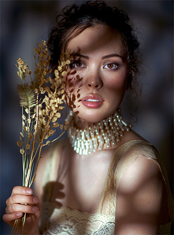
Dappled light makes portraits much more interesting.
A sample dappled light image, courtesy of PetaPixel.com.
This tip, written by Michael Zhang, first appeared in PetaPixel.com. This is a summary.
If you’re looking for at-home photo ideas, here’s an 18-minute behind-the-scenes video by photographer Irene Rudnyk showing how you can get dappled light for a portrait shoot with a small budget and studio space.
In searching for interesting lighting, Rudnyk stumbled across a tutorial by photographer Jake Hicks on emulating dappled light — like what you get through leaves on a sunny day — in the studio.
You’ll need to buy a set of glass blocks. These wave pattern glass blocks are commonly used for windows and walls in showers, bathrooms, and basements. They may cost around $4 each (or less if you find a deal or buy in bulk).
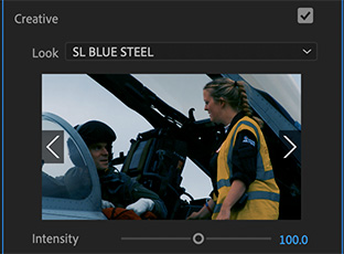
Looks are designed for fast and easy color grading – and applied effects.
A Blue Steel look applied to a clip. (Image courtesy of Hallmark Broadcast Ltd.)
Looks are color-correction and effects presets that quickly change the look of a video clip to something different.
These exist in both Premiere (Lumetri > Color > Looks) and Final Cut (Effects Browser > Looks).
In Final Cut, these are some looks that purely affect the color (i.e. Film Noir), but the majority emphasize an effect more than a look (Rain, CamCorder, Aged Film). Final Cut is trying to help editors who know what they want, but don’t know how to achieve it, get the effect they need for their project.
In Premiere, looks are much more color oriented and there are far more of them, close to eighty, depending upon how you count. You select them from the Creative section of the Lumetri color panel. Premiere is trying to help solve sophisticated color grading challenges without understanding color.
The good thing about all of these looks is that there isn’t a whole lot to adjust. If you like the effect, use it. If not, you can try tweaking, but mostly you just delete it and try something different.
Please rate the helpfulness of this tip.
Click on a star to rate it!
https://www.theinsidetips.com/wp-content/uploads/2019/09/Tips-Logo-700x150.jpg00Larry Jordanhttps://www.theinsidetips.com/wp-content/uploads/2019/09/Tips-Logo-700x150.jpgLarry Jordan2020-04-01 01:30:002020-04-01 01:30:00Tip #579: What Do “Looks” Do?
We may request cookies to be set on your device. We use cookies to let us know when you visit our websites, how you interact with us, to enrich your user experience, and to customize your relationship with our website.
Click on the different category headings to find out more. You can also change some of your preferences. Note that blocking some types of cookies may impact your experience on our websites and the services we are able to offer.
Essential Website Cookies
These cookies are strictly necessary to provide you with services available through our website and to use some of its features.
Because these cookies are strictly necessary to deliver the website, refuseing them will have impact how our site functions. You always can block or delete cookies by changing your browser settings and force blocking all cookies on this website. But this will always prompt you to accept/refuse cookies when revisiting our site.
We fully respect if you want to refuse cookies but to avoid asking you again and again kindly allow us to store a cookie for that. You are free to opt out any time or opt in for other cookies to get a better experience. If you refuse cookies we will remove all set cookies in our domain.
We provide you with a list of stored cookies on your computer in our domain so you can check what we stored. Due to security reasons we are not able to show or modify cookies from other domains. You can check these in your browser security settings.
Google Analytics Cookies
These cookies collect information that is used either in aggregate form to help us understand how our website is being used or how effective our marketing campaigns are, or to help us customize our website and application for you in order to enhance your experience.
If you do not want that we track your visit to our site you can disable tracking in your browser here:
Other external services
We also use different external services like Google Webfonts, Google Maps, and external Video providers. Since these providers may collect personal data like your IP address we allow you to block them here. Please be aware that this might heavily reduce the functionality and appearance of our site. Changes will take effect once you reload the page.
Google Webfont Settings:
Google Map Settings:
Google reCaptcha Settings:
Vimeo and Youtube video embeds:
Other cookies
The following cookies are also needed - You can choose if you want to allow them:
Privacy Policy
You can read about our cookies and privacy settings in detail on our Privacy Policy Page.